{{lgCode}} FR FrançaisEN EnglishES EspañolIT ItalianoDE Deutsch
Client Oni Qui Riz
Role Identity, art direction
Deliverables Logo, brand guidelines, applications
Year 2025
ONI QUI RIZ • BRAND DESIGN • VISUAL IDENTITY • ART DIRECTION • ONI QUI RIZ • BRAND DESIGN • VISUAL IDENTITY • ART DIRECTION • ONI QUI RIZ • BRAND DESIGN • VISUAL IDENTITY • ART DIRECTION • ONI QUI RIZ • BRAND DESIGN • VISUAL IDENTITY • ART DIRECTION • ONI QUI RIZ • BRAND DESIGN • VISUAL IDENTITY • ART DIRECTION • ONI QUI RIZ • BRAND DESIGN • VISUAL IDENTITY • ART DIRECTION •
01
The brief
Designing an identity that appeals, is understood at a glance and adapts to every medium.
01 The context Introduce the client here, their business and what sparked the project.
02 The identity Describe the chosen brand direction and the intentions behind each decision.
03 The materials List the materials created: packaging, print, digital, signage…
04 What’s next Explain how the brand is evolving and what remains to be built.
02
The starting point
My role Art director, from concept to delivery. Describe your role here, your tasks and the key stages of the project: from understanding the need through to delivering the files and materials.
10+ +
applications created (figure to be adjusted)
3
routes explored before the final version
1
brand delivered, ready to live
03
The colours
D1D1D8 A3A4B0 747689 464961 181B3A 13162E 0E1023
Kashi Iro A deep colour, for text and bold backgrounds.
HEX 181B3A E1D3D3 C3A7A7 A47C7B 86504F 682423 531D1C 3E1615
Hazuki Iro A deep red, for accents and details.
HEX 682423 FFFEFD FEFDFA FEFCF8 FDFBF5 FDFAF3 CAC8C2 989692
Shironeri A light base, to let the brand breathe.
HEX FDFAF3 D6D6D6 ACACAC 838383 595959 303030 262626 1D1D1D
Sumi Iro An ink grey, for secondary text and details.
HEX 303030
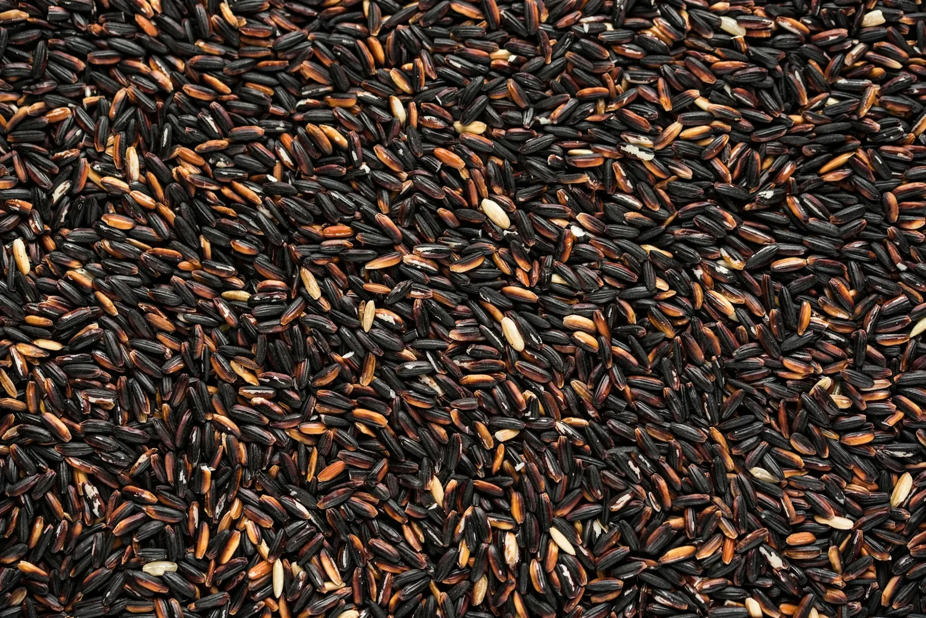
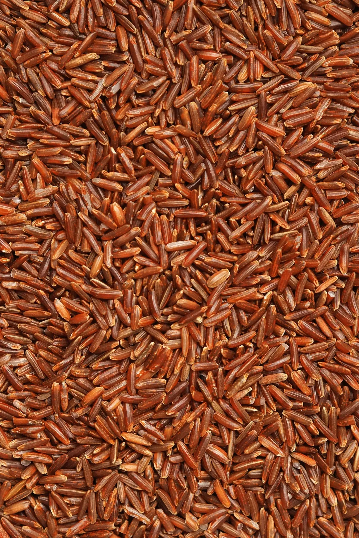
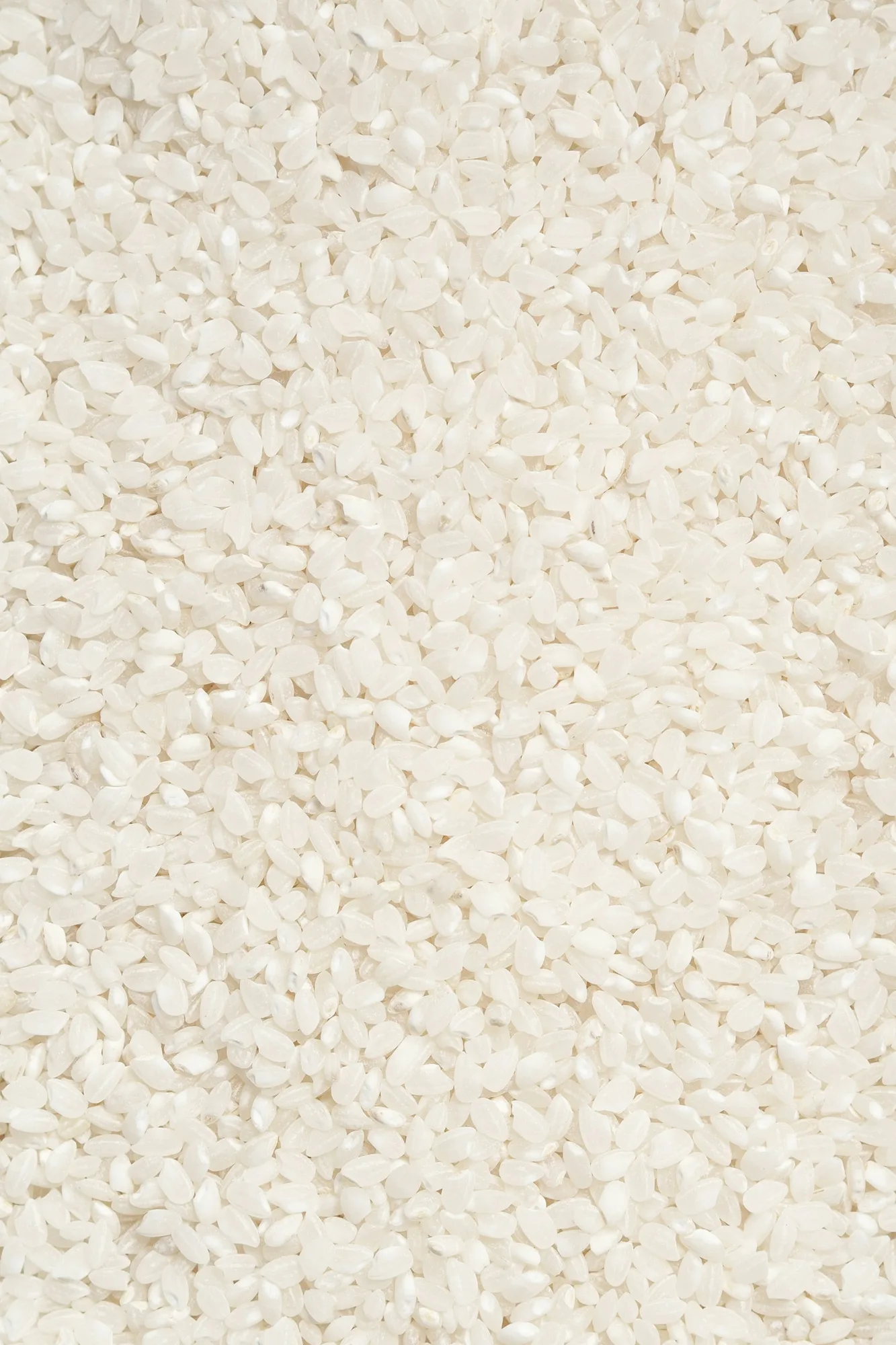
Black rice Red rice White rice
The rule A simple palette, four colours. Explain the choice of colours: their symbolism, their role in the brand and how they are split between backgrounds, text and accents.
Distribution Neutral base, measured accents.
04
The idea
Tell the creative concept here: where the idea comes from, what it expresses and why it serves the brand.
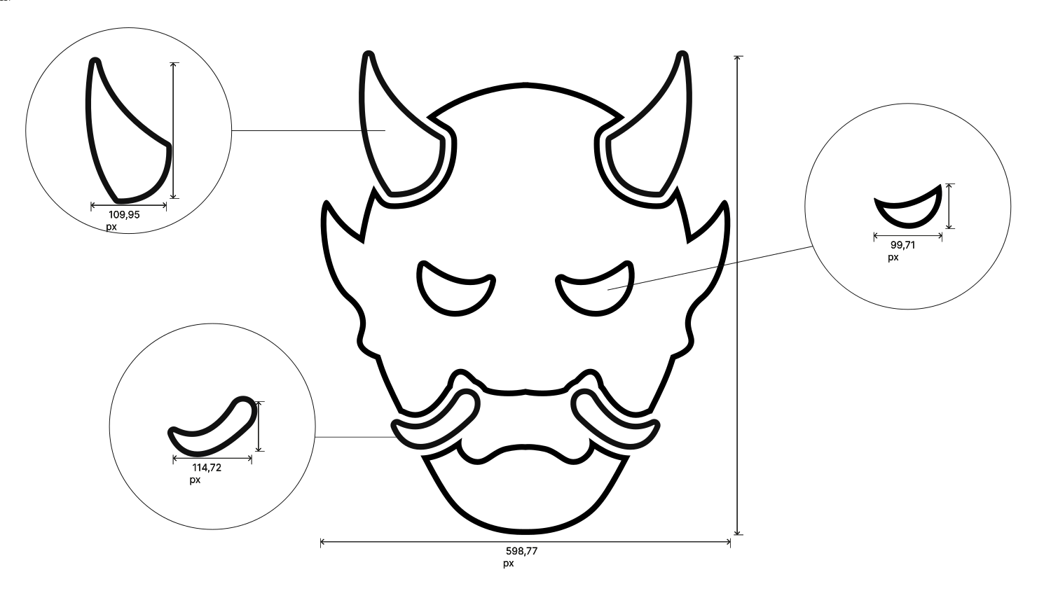
Detail how the concept translates visually: shapes, textures, images, layout.
The monogram The cups
05
Typography
Two families, two roles: Gokan for the logotype and headings, Raleway for the menu text.
Text & menus Raleway Thin Light Regular Bold Heavy
1 2 3 4 5 Cap height x-height Baseline Descender 1 Flat apex The A doesn’t end in a point: its apex is cut cleanly, horizontally.2 Low crossbar The A’s crossbar sits low: the inner triangle stretches and the letter gains elegance.3 Oval bowl The bowl of the g forms an open, even oval.4 Curved foot The a ends in a small curved foot, one of Raleway’s signatures.5 Hook of the g The g’s descender curves back up in an open hook.A fine, elegant sans-serif used for the menu text: dish names, descriptions and prices. Its lightness balances Gokan’s strength.
Logotype & headings Regular 1 2 3 4 5 Cap height x-height Baseline Descender 1 Stencil cuts A fine cut runs through each letter, like a stencil: in the A, the a and the g.2 Softened corners The blocks are massive, but their outer corners are slightly rounded.3 Bevel The top of the a is bevelled with a clean stroke.4 Rounded bowl Only the bowl of the a is rounded, contrasting with the straight shapes.5 Massive descender The g’s descender forms a solid block, as wide as the letter.A very bold, block-shaped display face used for the “Oni Qui Riz” logotype and menu headings. Its sharp cuts give it a strong character.
06
The logo
Oni Qui Riz
Present the logo here: its concept, its variations (colour, black, white) and the essential usage rules.
Hazuki Iro Shironeri Sumi Iro Logo · variations
A strong sentence to be replaced, summing up what the project conveys: to the brand, to its customers, to its audience.
07
Brand applications
Show how the identity carries across materials: packaging, print, social media, website…
Packaging Menus Posters Bag
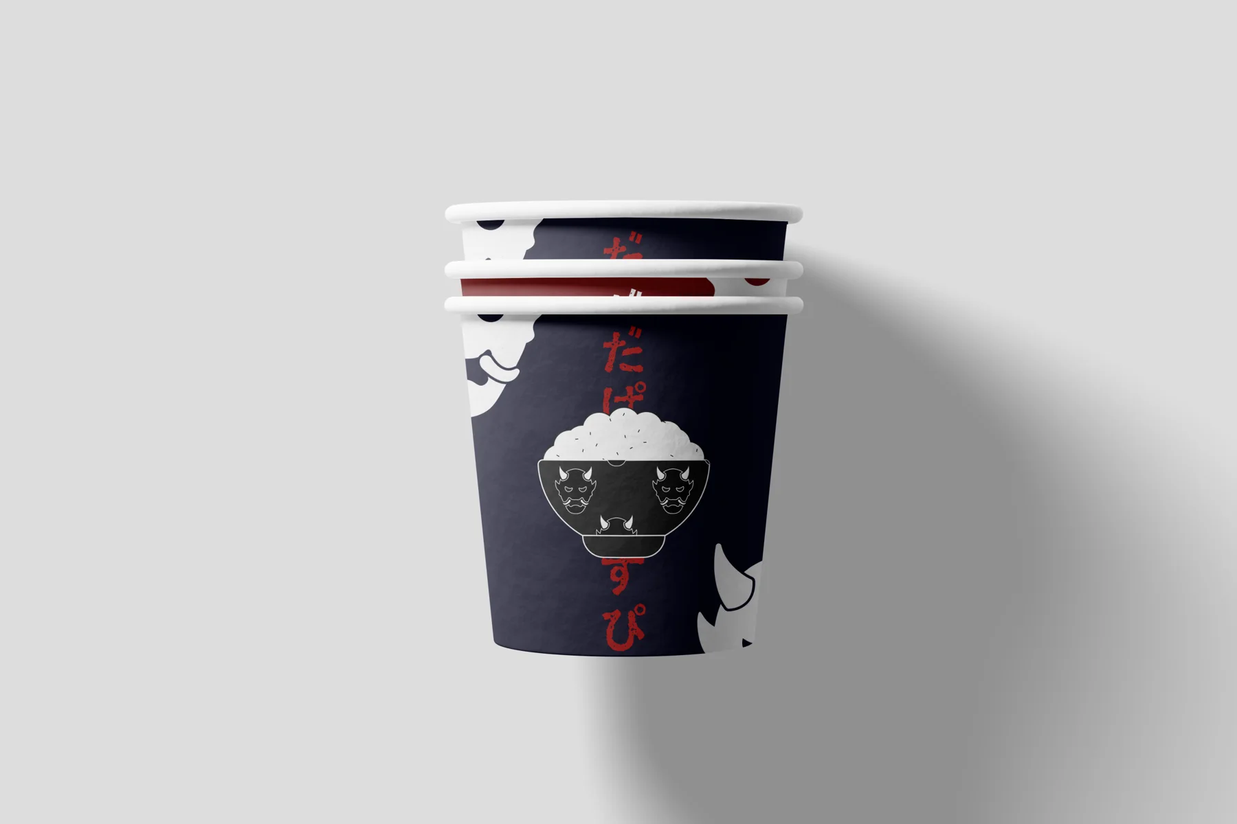
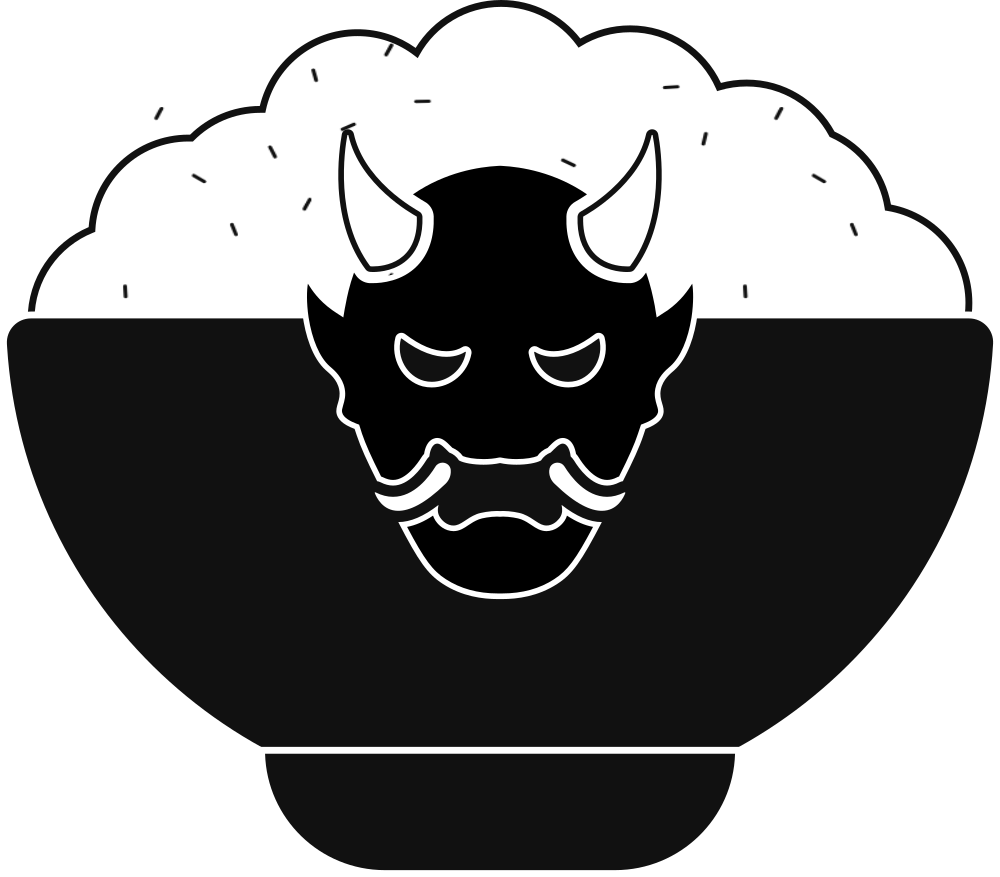
01 · Packaging The cups. The rice bowl and its oni masks on a Kashi Iro background, with Japanese characters in red.
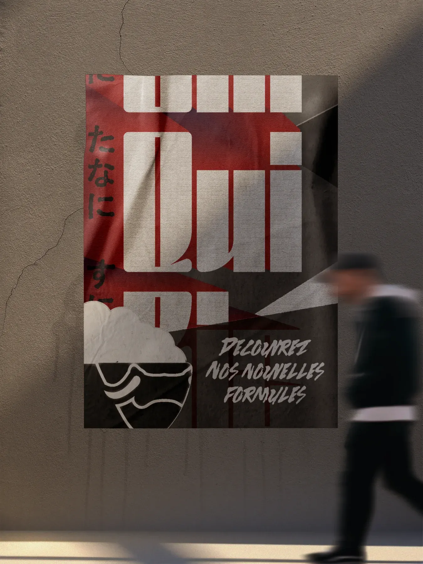
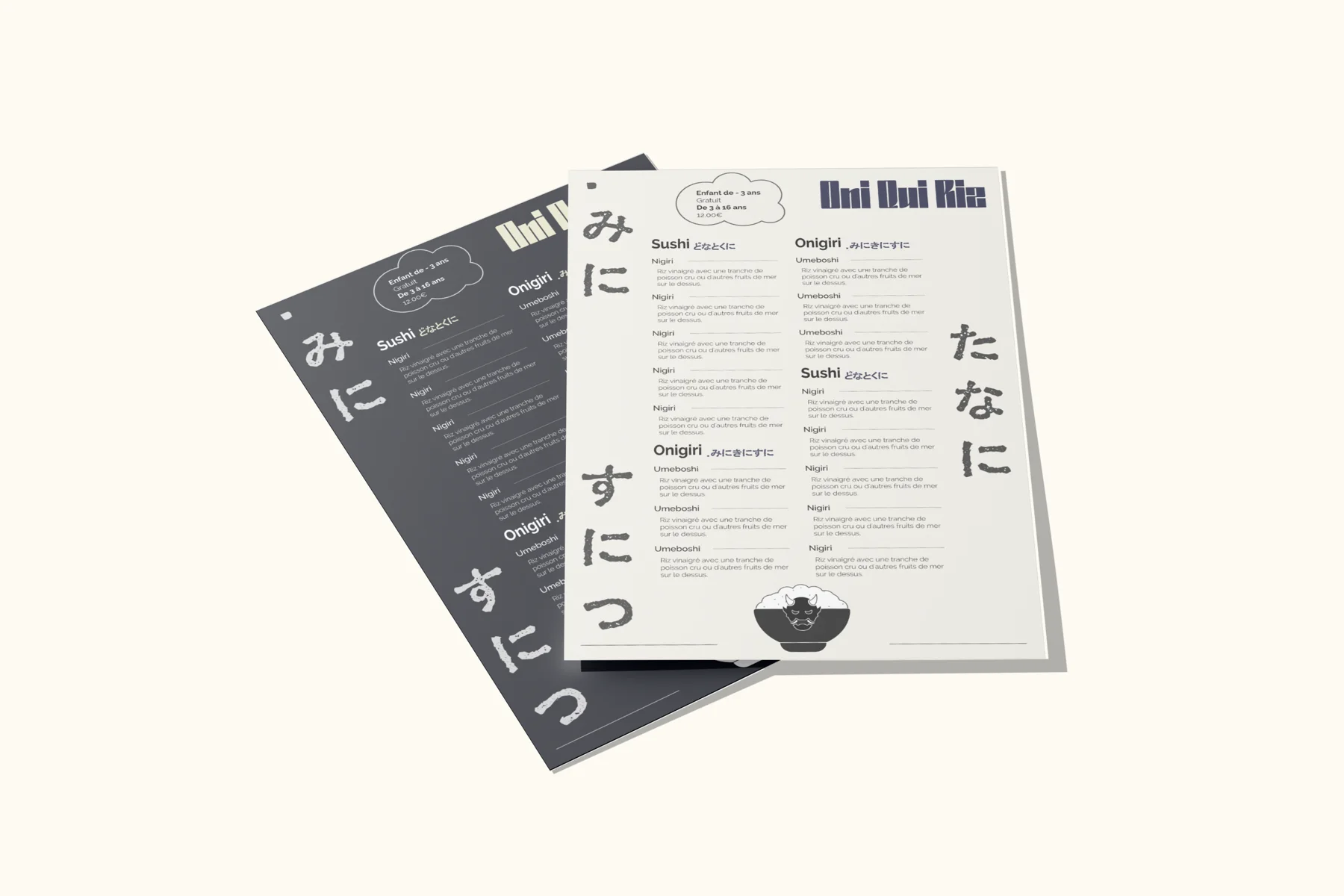
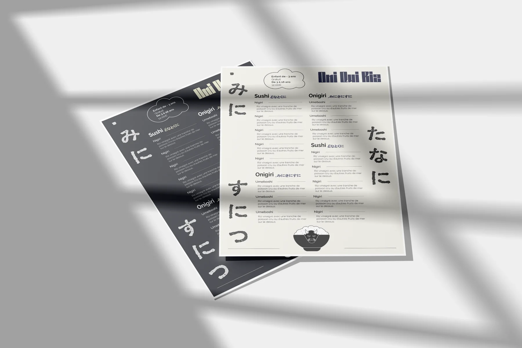
02 · Menus The menus. A light version and a dark version, punctuated by large Japanese characters.
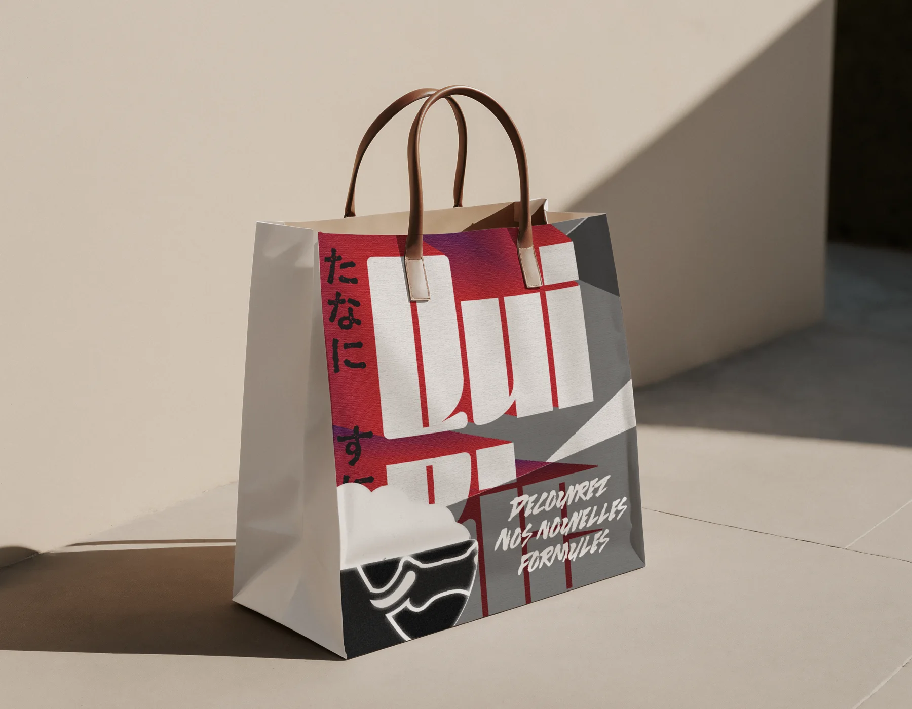
03 · Bag The bag. The poster visual repeated on the bag: “Discover our new set menus”.
04 · Social media A short heading. Describe this medium and what makes it unique.
05 · Signage A short heading. Describe this medium and what makes it unique.
06 · Other materials A short heading. Describe this medium and what makes it unique.
08
An identity built to last
Explain the long-term vision here: how the brand can grow, which products or materials could follow.
Today What already exists and what it brings.
What’s next The next steps planned for the brand.
Tomorrow The longer-term avenues.
09
What I take away
A clear idea The key takeaway from the creative approach.
A coherent system The key takeaway from the execution.
A useful result The key takeaway from the result for the client.