ODKOREA • 디자인 • 전자책 • 이커머스 사이트 • 블로그 • 인플루언서 콘텐츠 • ODKOREA • 디자인 • 전자책 • 이커머스 사이트 • 블로그 • 인플루언서 콘텐츠 • ODKOREA • 디자인 • 전자책 • 이커머스 사이트 • 블로그 • 인플루언서 콘텐츠 • ODKOREA • 디자인 • 전자책 • 이커머스 사이트 • 블로그 • 인플루언서 콘텐츠 • ODKOREA • 디자인 • 전자책 • 이커머스 사이트 • 블로그 • 인플루언서 콘텐츠 • ODKOREA • 디자인 • 전자책 • 이커머스 사이트 • 블로그 • 인플루언서 콘텐츠 •
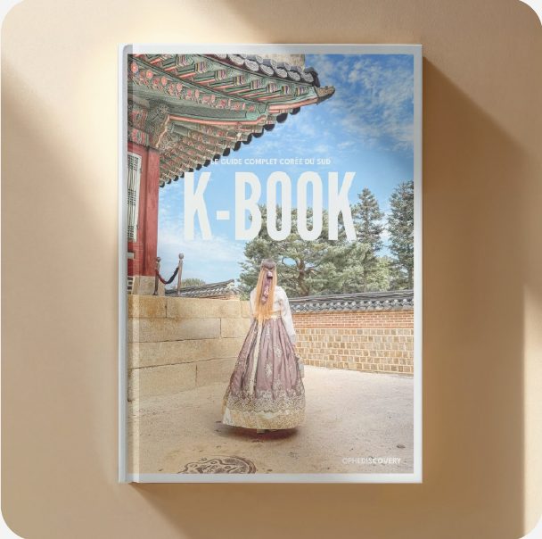
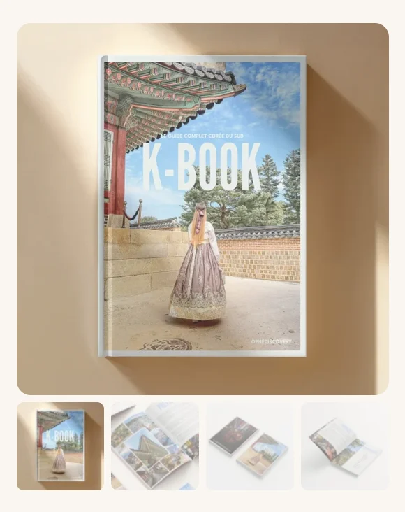
Proofreading, rewriting and layout of OpheDiscovery’s first e-book: over 80 pages of travel, tips and great addresses in South Korea.
02
The brand
Building an identity for what could become a brand, without locking it into a single country.
03
The website
Putting the first e-book on sale quickly, planning from the start for more to follow.
04
Going hybrid
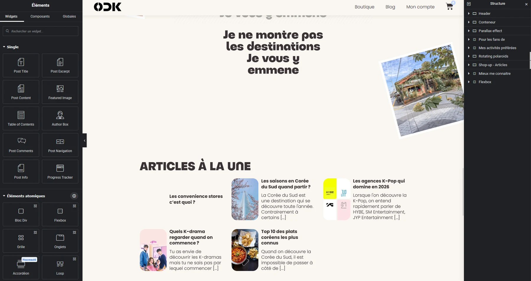
At the end of the build, the e-commerce site went hybrid: a shop to sell the e-books and a blog to publish the creator’s content, brought together under one brand.
02
The first step
My role
Editorial supervisor, then layout designer.
Correcting, expanding and cutting passages to convey the information the way the creator wanted. Making this first format accessible while staying rooted in the reality of a trip to Korea: my first challenge. Then laying out the content, images and illustrations.
80++
pages of travel, tips and great addresses
1MOIS
of travel, activities and great addresses to sort, present and tell
1
first e-book launched, with strong sales from day one
03
The colours
3A32353A3235 · 50%3A3235 · 20%3A3235 · 5%
Giwa기와 · the roof tiles of traditional buildings
HEX 3A3235 RGB 58, 50, 53 CMYK 0, 14, 9, 77
FAF6F1FAF6F1 · 50%FAF6F1 · 20%
Hanji한지 · traditional Korean paper
HEX FAF6F1 RGB 250, 246, 241 CMYK 0, 2, 4, 2
AA223DEA99AAF4C7D0F4C7D0 · 20%
Cherry파스텔 · the cherry blossoms of Korean spring
HEX F4C7D0 RGB 244, 199, 208 CMYK 0, 18, 15, 4
1C32B185B1FFC2D8FFC2D8FF · 50%
Sapphir파스텔 · the stone of jewels and treasures
HEX C2D8FF RGB 194, 216, 255 CMYK 24, 15, 0, 0
The rule
One guideline: pastel colours.
The light of South Korea, from red to pink, from azure to navy, by way of greys of different temperatures. A mood that prepares you to read the brand, with a soft base and a single contrasting accent reserved for headings and buttons.
Distribution
90% soft base, 10% accent.
04
3, 2, 1
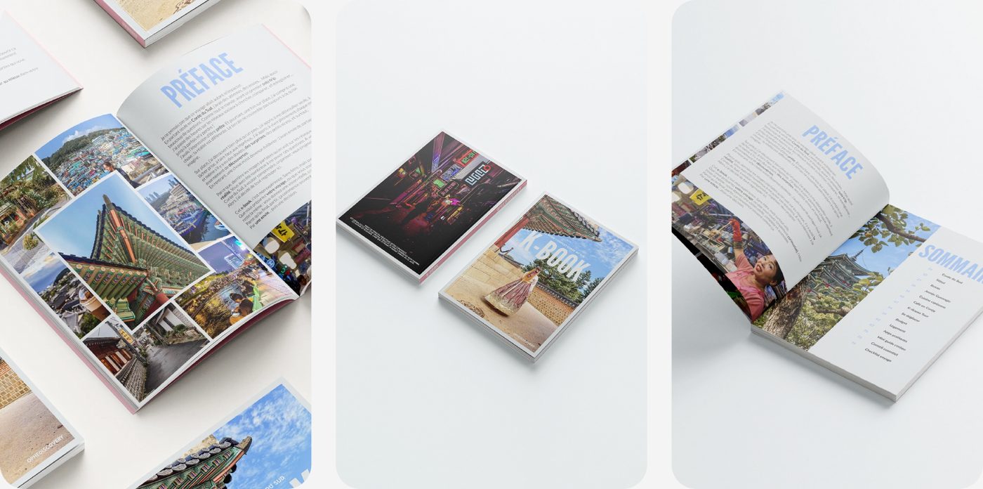
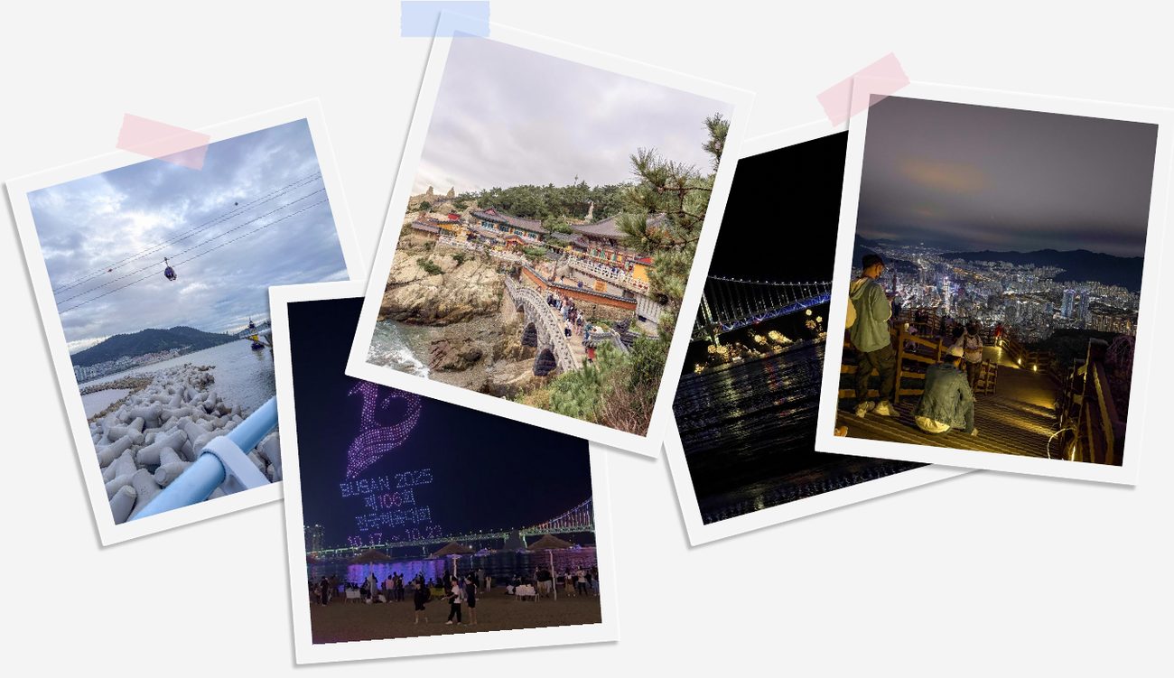
As for any content creator, photos, video and editing were at the heart of the trip and of the making of the e-book. I wanted to convey that feeling of a captured moment.
An aesthetic nod, but also a layout solution that thinks outside the box: with lots of photos and illustrations, I chose a raised effect, with pinned Polaroids and taped film strips.
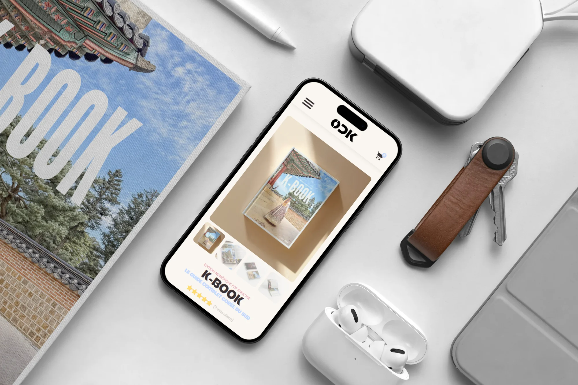
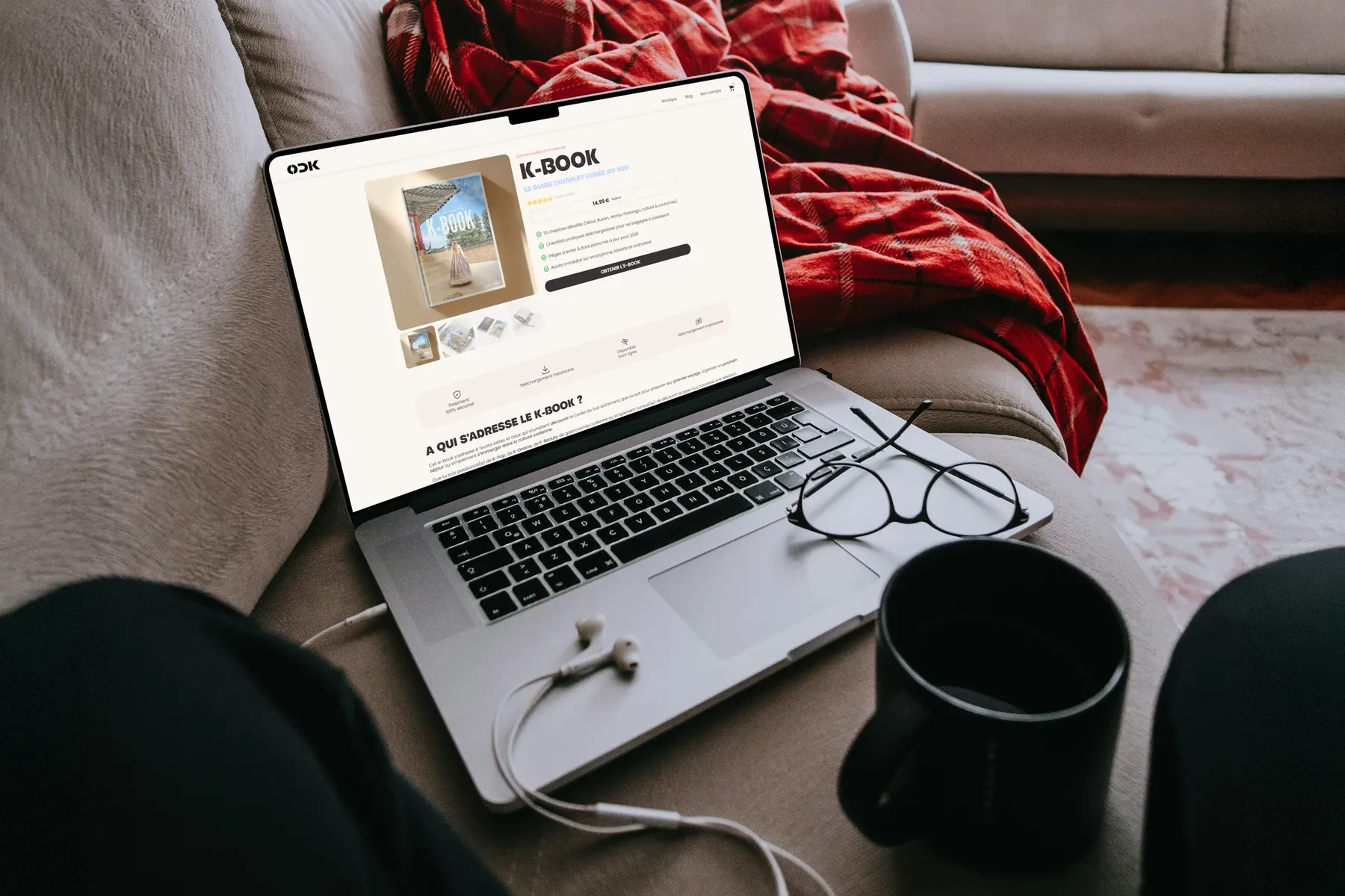
The magazine’s pillarsThe K-Book product page
05
Typography
Two families, two roles. Poppins carries the reading: it is built with a compass. Bongkah carries the voice: it is carved from the block. Their contrast is what creates the hierarchy.
Text & interfacePoppinsLightRegularSemiBold
12345Cap heightx-heightBaselineDescender
1Nested ovalsThe bowls of the a and g follow the same design: two nested ovals, slightly taller than they are wide.
2Constant weightThe bowl and the stem have the same thickness: a monolinear stroke, calm and neutral.
3Straight stemsPerfectly vertical stems and cleanly cut terminals.
4Rigid diagonalsThe A stands on two taut diagonals and a flattened apex.
5Generous x-heightThe lowercase letters are large: the text stays legible, even at small sizes.
Geometric, modern, minimalist and accessible shapes. It echoes Korean culture, designed and made for everyone. Its contrast with Bongkah enables strong visuals, whether explanatory or demonstrative.
1The massThick stems, nearly a third of the letter’s height: it has weight and presence.
2The notchA notch separates the stem from the bowl of the B: the mass can breathe.
3The clean cutThe arms of the K don’t touch the stem: a clean, almost chiselled cut.
4Full curvesThe O and G are round and dense, with narrow counters.
5The truncated apexThe A is cut flat: stable, rigid, with no point.
A higher level of creativity without losing accessibility: boldness without losing the reader. Easily recognisable, it serves simple and complex visual hierarchies alike.
06
The logo
OD+Korea
OD, the two letters of her username (OpheDiscovery), a starting point. Korea, the location, without ruling out a next chapter in another country.
After the book and the brand came the first version of the website. I knew it would be redesigned, but the publishing schedule called for a quick v1: build the essentials to analyse sales straight away.
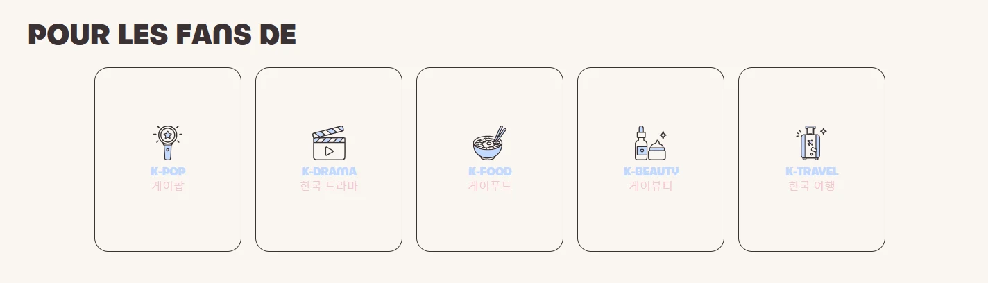
K-PopK-FoodK-BeautyK-DramaK-Travel
01 · Architecture
A well-organised magazine.
The five pillars of Korean culture to file every article, clean URLs and a clear menu.
02 · Shop
E-books that sell.
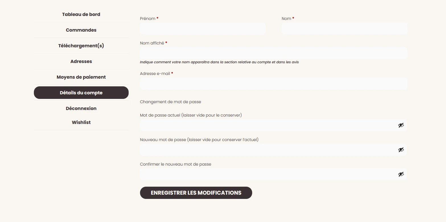
WooCommerce, a My account page with orders and downloads, and delivery via secure link.
03 · Autonomy
She publishes on her own.
Custom fields and a restricted role: the creator writes her own articles.
04 · SEO
Findable from day one.
Article schema for the magazine and Product schema for the e-books, with tags and tracking in place.
05 · Performance
Lightweight images.
Three WebP sizes (2000, 1200 and 600 px) and server-side compression.
06 · Responsive
From 375 to 1440 px.
A 12, 8 or 4-column grid depending on the screen, designed for mobile and desktop.
08
Take-off
Around fifteen sales hoped for. Over fifty-five on the counter.
At launch in mid-2026, the client hoped for around fifteen sales by the end of the year and about a hundred extra visitors a month. Sales took off from day one, and the year’s target was smashed well ahead of schedule.
extra visits every month, against about a hundred expected.
Expected+100
Achieved+400 – 500
× 4 à 5 the expected traffic
Readers want moreReaders are already asking for the next e-books.
An e-book people give as a giftFollowers buy it to introduce it to their loved ones.
Enthusiastic feedbackThe messages received after reading are overwhelmingly positive.
09
A brand designed to grow
The goal is to sell digital products, but ODKorea is thinking bigger: a growing audience eager to discover South Korea’s lifestyles, culture and innovations.
Today
A first e-book and a v1 shop to gauge the response.
The v2
A site redesigned based on sales and followers’ feedback. A guide dedicated to Seoul is in the works.
Tomorrow
Courses, travel itineraries, follower meet-ups, live cooking sessions, clothing and accessories: the brand keeps every door open.
10
What I take away
Designing to communicate
A website must get the information across before it is pretty.
A v1 to learn from
Publish the essentials straight away and let sales decide what comes next.
A system, not a deliverable
A reusable universe the client keeps alive on her own.