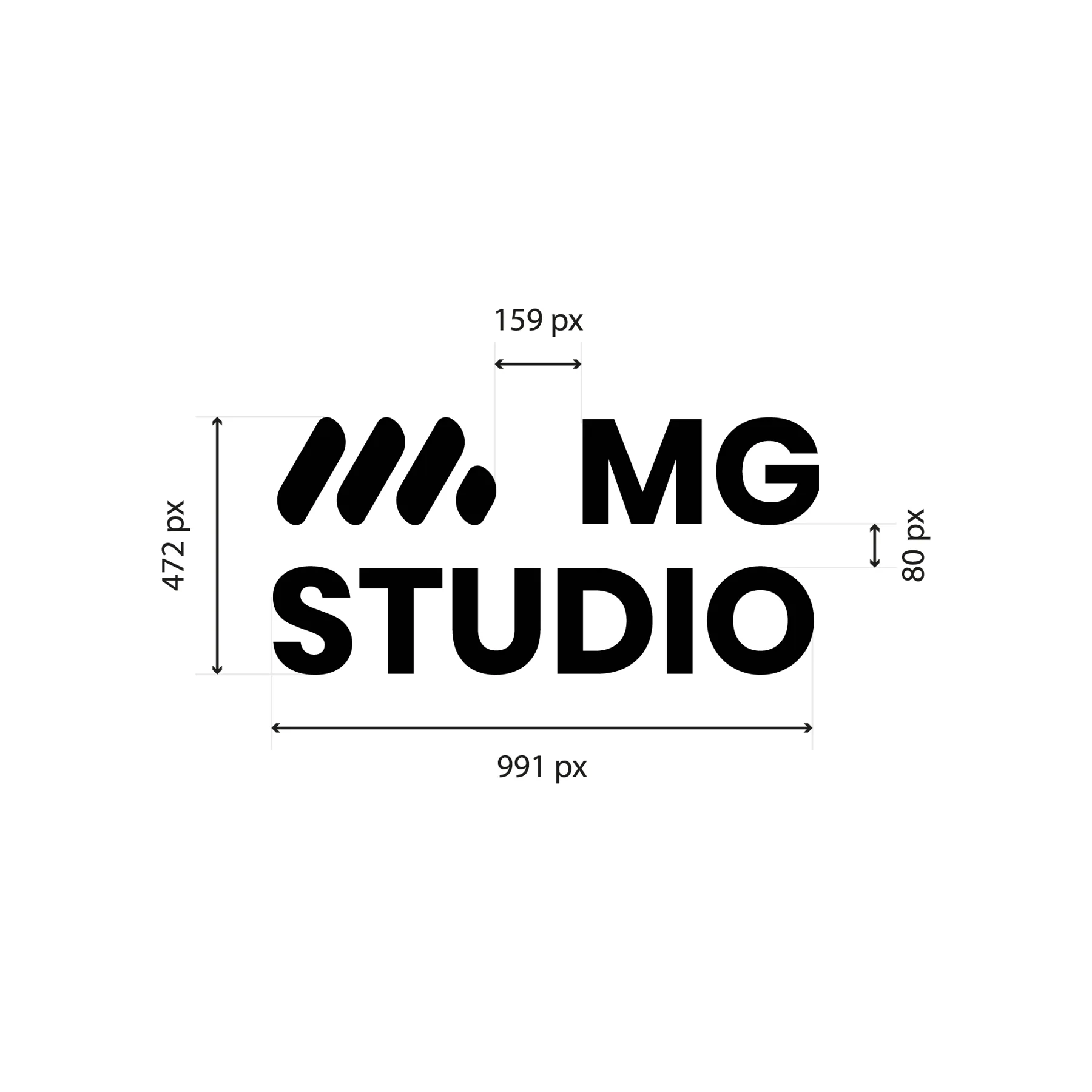
Originally the branding for what was to be my web agency, conceived two years ago. The initial name, “MG Studio”, was dropped: it was already taken.
02
The identity
A strong, convincing identity with a modern, irreverent tone, carried by four colours and four values.
03
The materials
The solid-shape logo and the colour palette.
04
What’s next
An agency that creates identities in line with my values, my principles and what I love to create.
02
The starting point
My role
My own brand, from name to identity.
I came up with my agency’s brand two years ago. The initial name, “MG Studio”, was already taken: it made way for MGGM, two of my initials that I use regularly, mirrored. I imagined an agency able to create identities in line with my values, my principles and what I love to create.
4
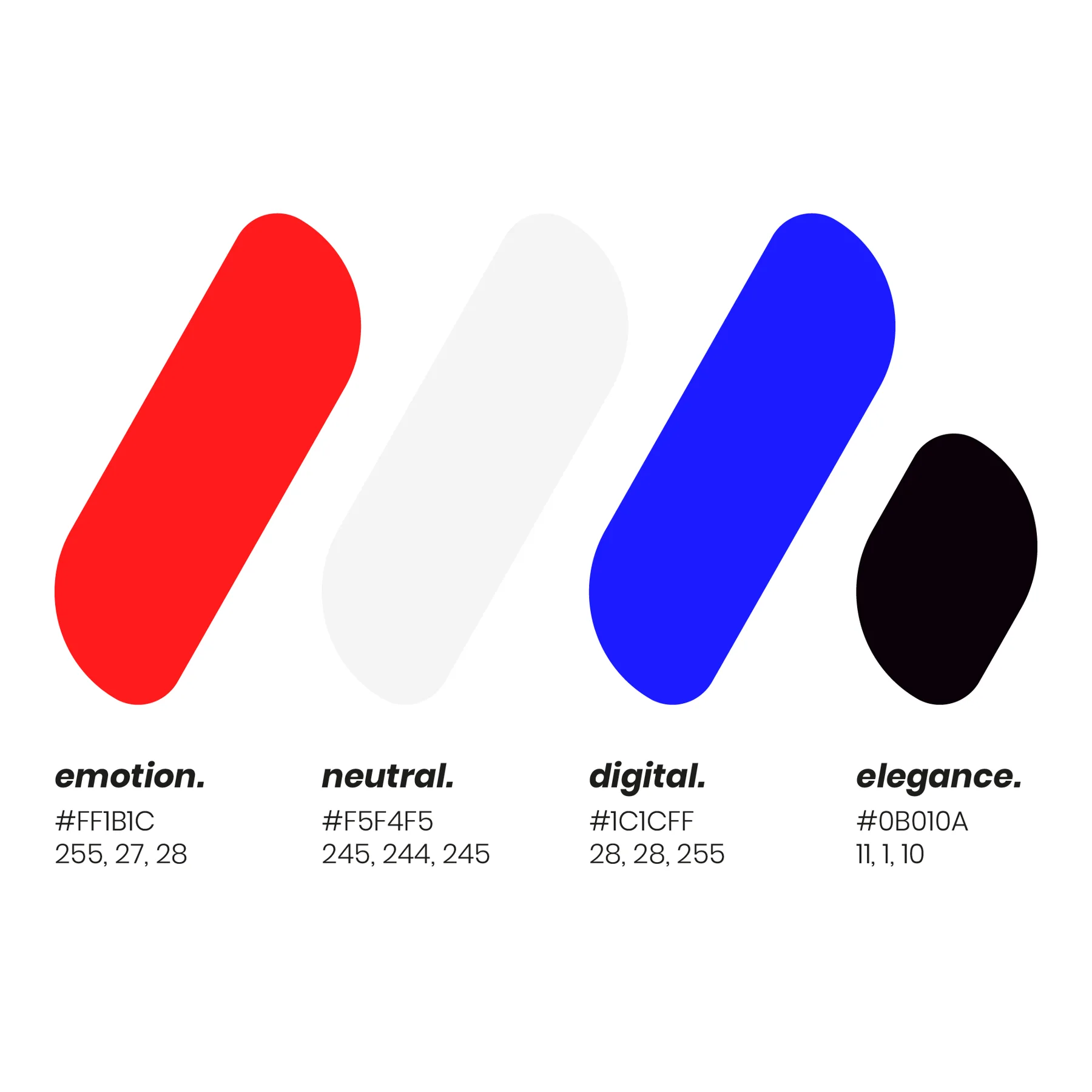
colours for four values: emotion, elegance, digital, neutrality
2
initials, MG, mirrored to form the name
1
solid-shape logo
03
The colours
FFD1D2FFA4A4FF7677FF4949FF1B1CCC1616991011
EmotionFor all the shapes and colours conveyed in my work.
HEX FF1B1C RGB 255, 27, 28 CMYK 0, 89, 89, 0
FDFDFDFBFBFBF9F8F9F7F6F7F5F4F5C4C3C4939293
NeutralThe balance to strike between a project’s ideas and the client’s wishes.
HEX F5F4F5 RGB 245, 244, 245 CMYK 0, 0, 0, 4
D2D2FFA4A4FF7777FF4949FF1C1CFF1616CC111199
DigitalDigital in both senses – the screen and the digit: drawing by hand, my original training.
HEX 1C1CFF RGB 28, 28, 255 CMYK 89, 89, 0, 0
CECCCE9D999D6D676C3C343B0B010A090108070106
EleganceA common thread running through almost all my work.
HEX 0B010A RGB 11, 1, 10 CMYK 0, 91, 9, 96
The rule
Four colours, four values.
The colours were designed and approved to convey what the brand was meant to be: emotion, elegance, digital and neutrality. Digital has two sides: the digital world as most people understand it, and the digit – the finger – meaning drawing by hand, my original training.
Distribution
Neutral base, measured accents.
04
The idea
MGGM was originally the branding for what was to be my web agency. My ambition was to create an irreverent agency, where boldness and the courage to make strong decisions would give my clients remarkable identities that stand out from the competition in their field.
The goal isn’t to answer a request: it’s to turn an idea into something functional, effective and striking.
StickersThe pattern
05
Typography
A single family for the whole brand: Satoshi, from Light to Black.
Single typefaceSatoshiLightRegularMediumBoldBlack
12345Cap heightx-heightBaselineDescender
1Flat apexThe A ends in an apex cut cleanly, horizontally: a bold, modern shape.
2Ink trapsAt the joins of the a and g, the stroke dips slightly: the design stays crisp, even in the heaviest weights.
3Horizontal cutsThe stroke ends are cut horizontally, from the top of the a to the tail of the g.
4Round bowlThe bowl of the g forms an almost perfect oval: a full, legible letter.
5Taut diagonalsThe A stands on two straight, symmetrical diagonals.
A crisp, modern geometric sans-serif used on its own for the whole brand, from the logotype to the posters. Its weights, from Light to Black, and its italics are enough to create all the contrast the identity needs.
06
The logo
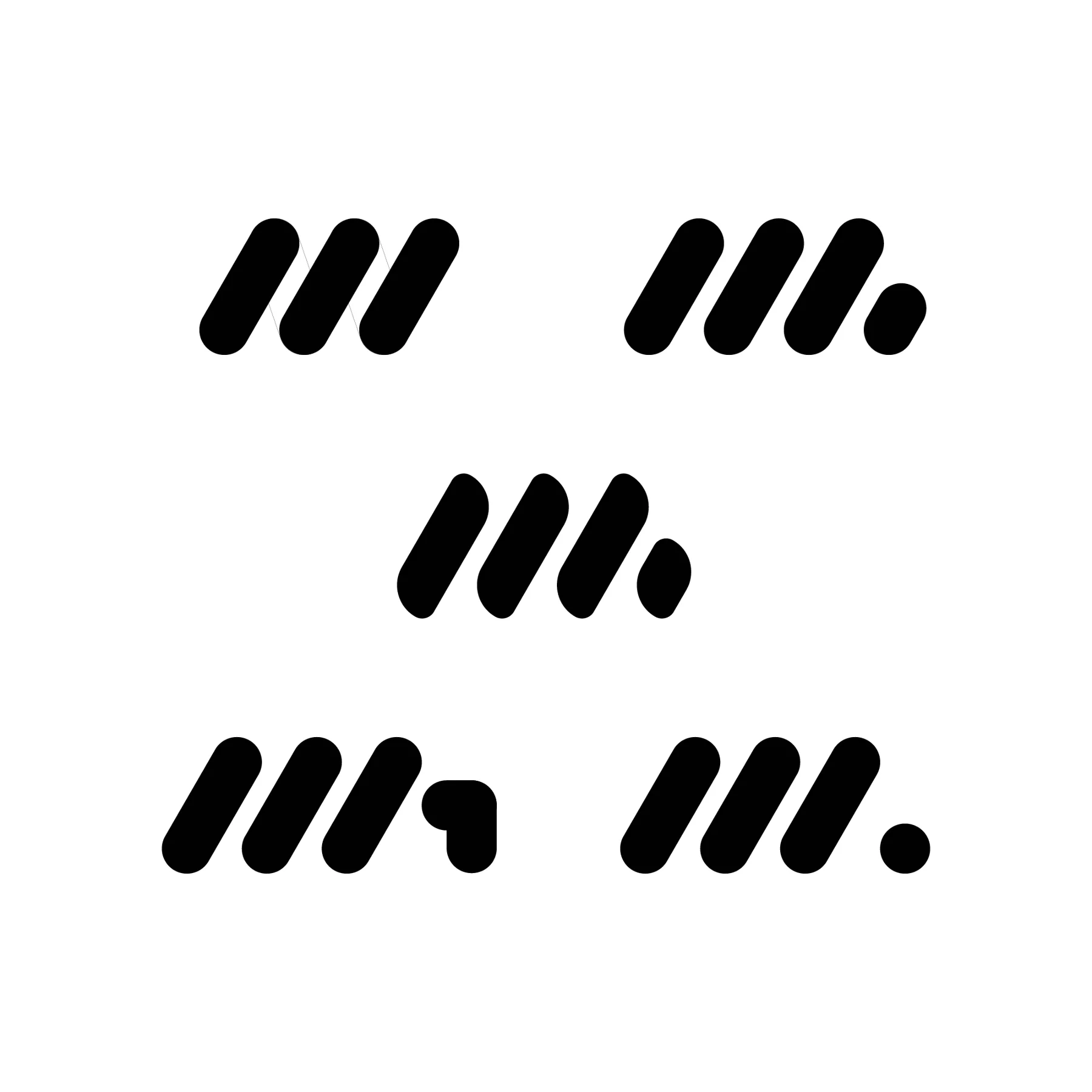
MGGM
A solid-shape logo representing MG: two of my initials, which I use regularly, mirrored to form the agency’s name.
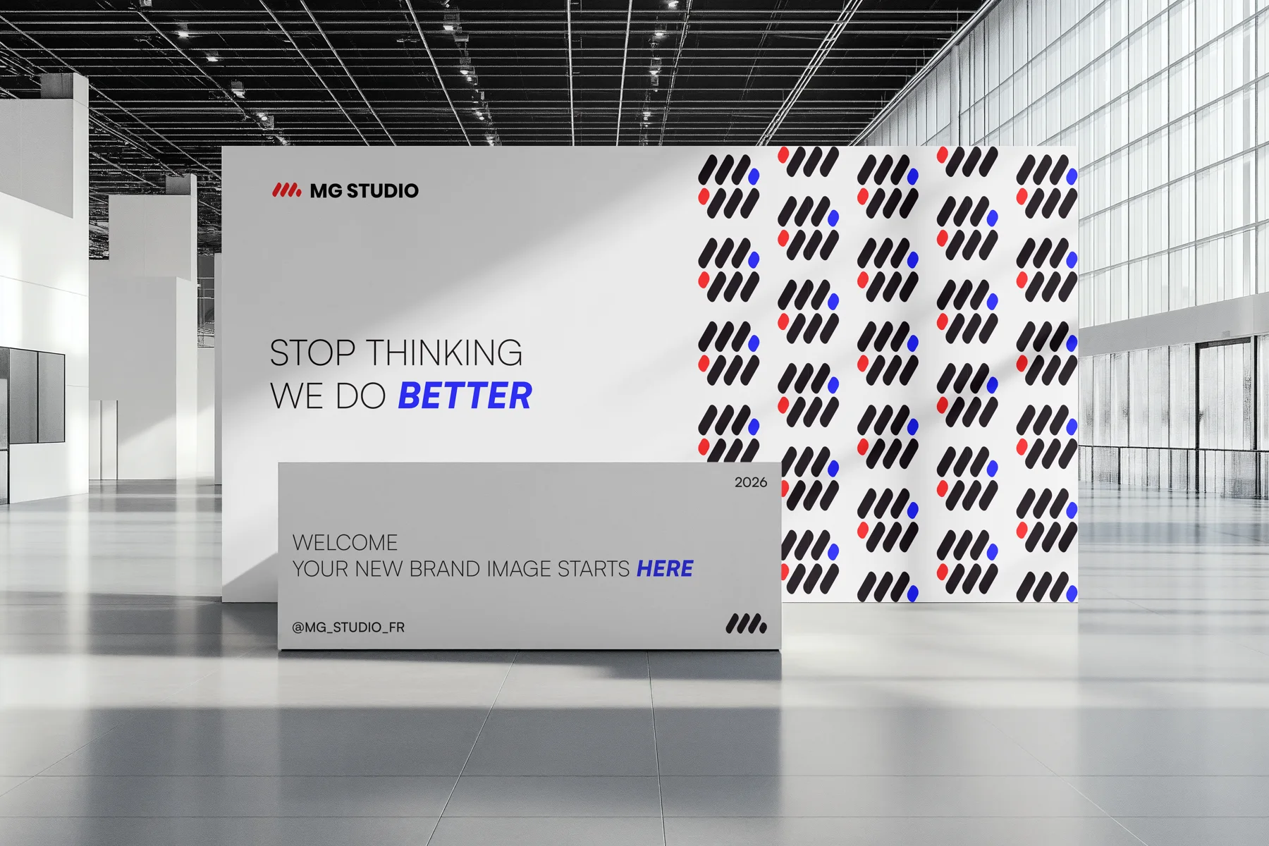
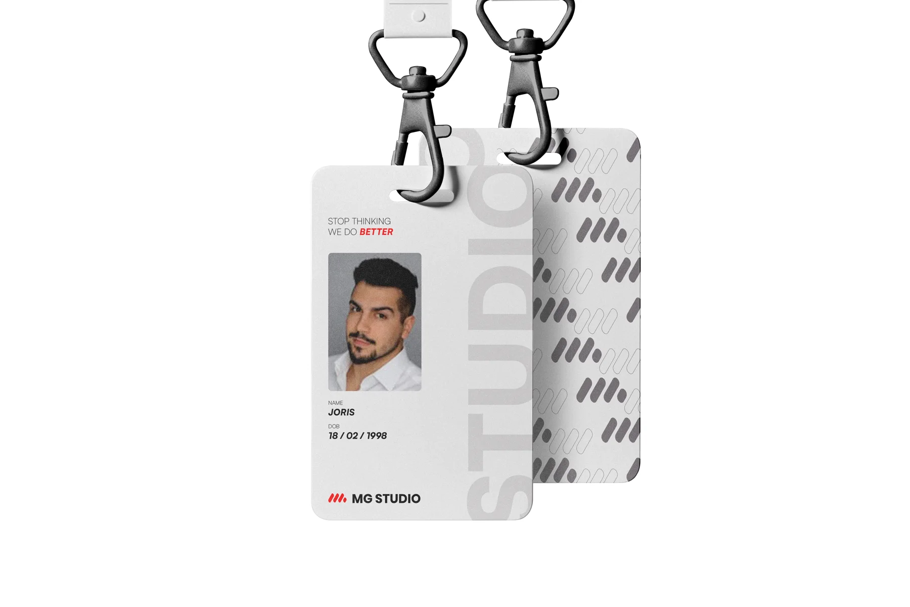
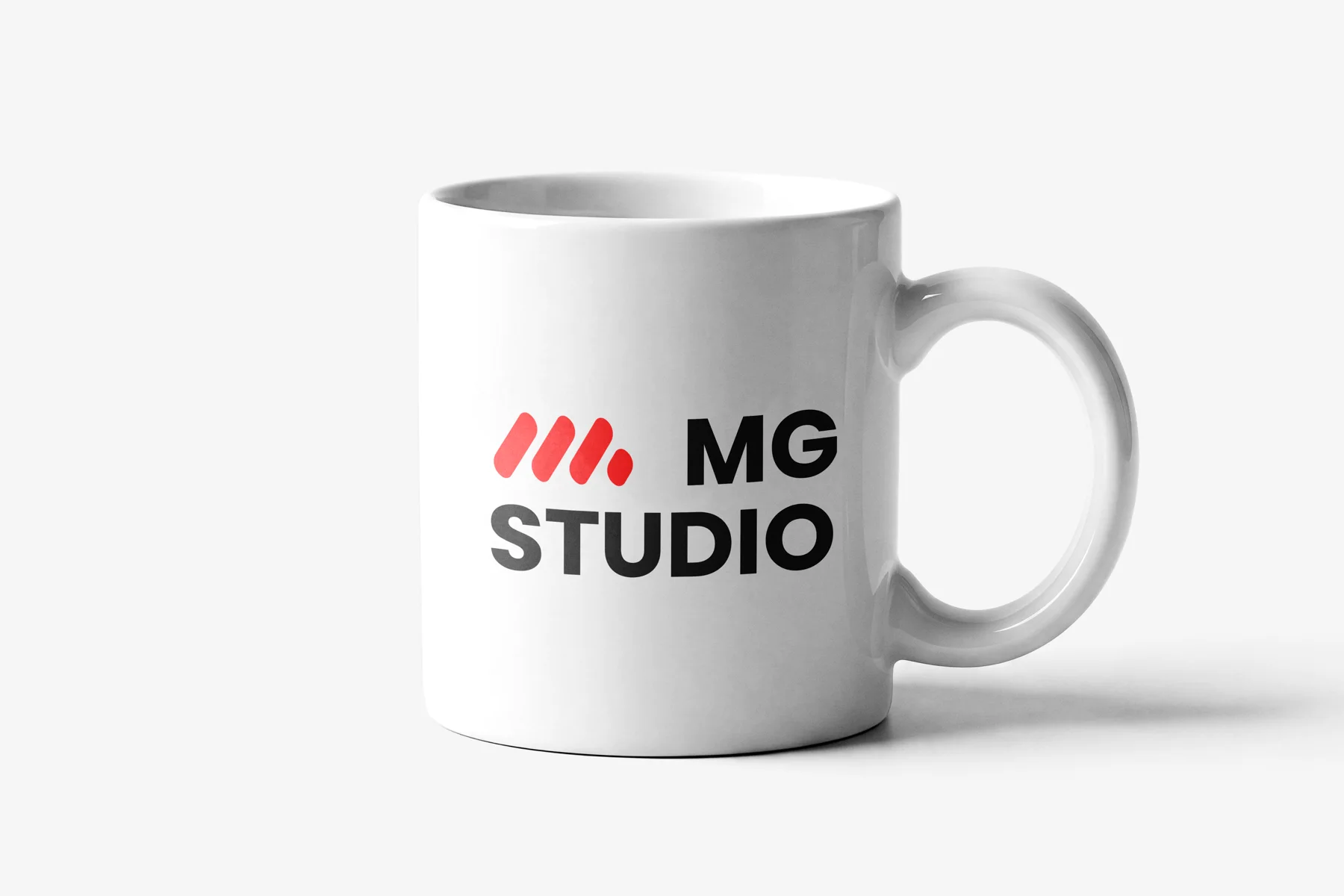
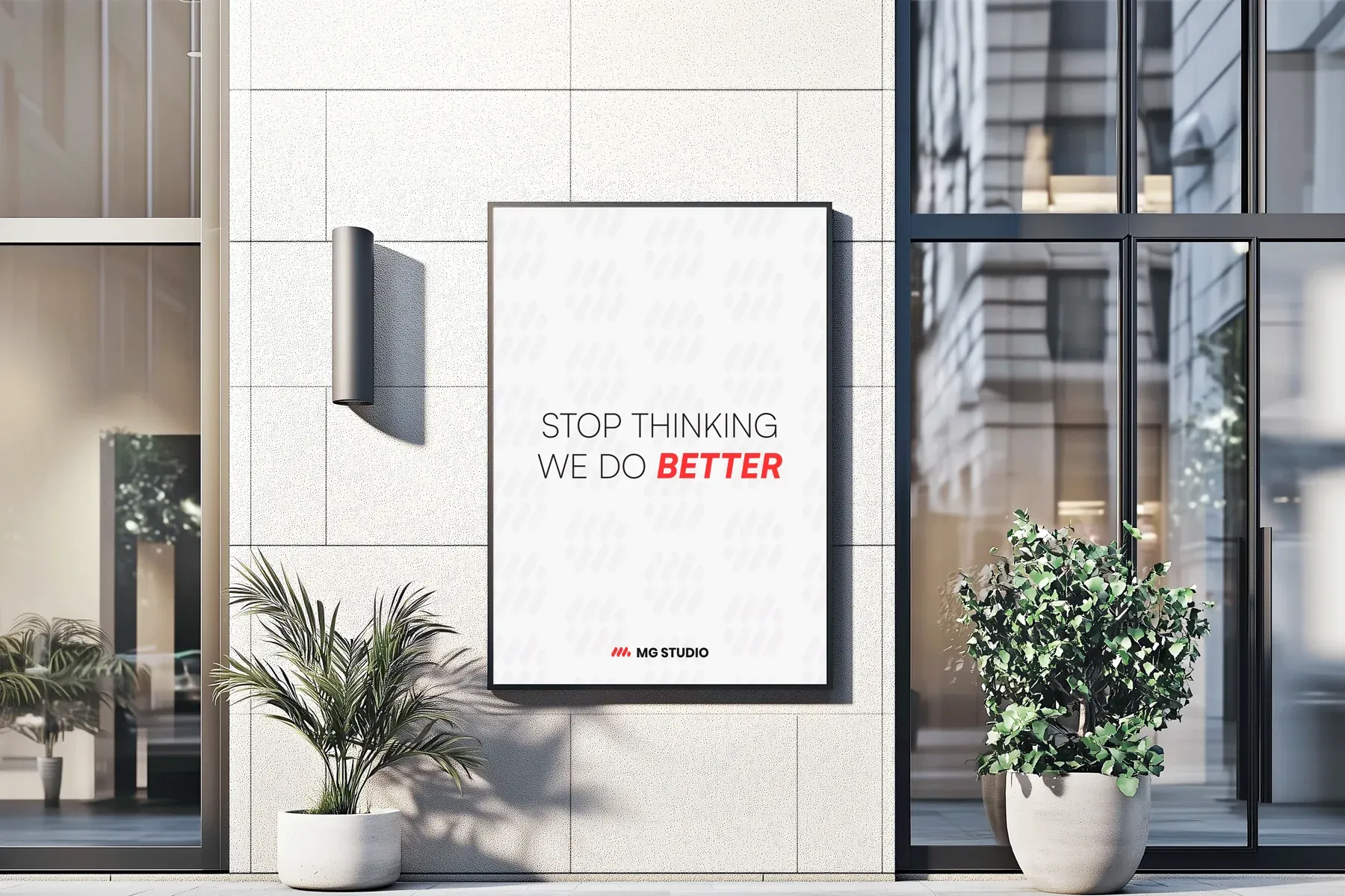
The identity carries across the agency’s materials, shown here under its original name, MG Studio: poster, stand, badges, stickers, mug and a pattern built from the logo.
PostersEventsStickersObjectsPattern
01 · Events
A recognisable stand.
The logo pattern, punctuated with red and blue, covers an entire wall.
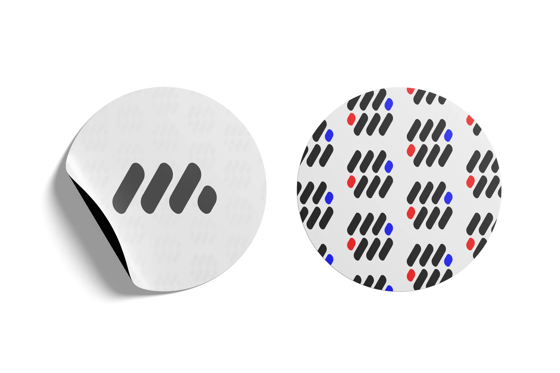
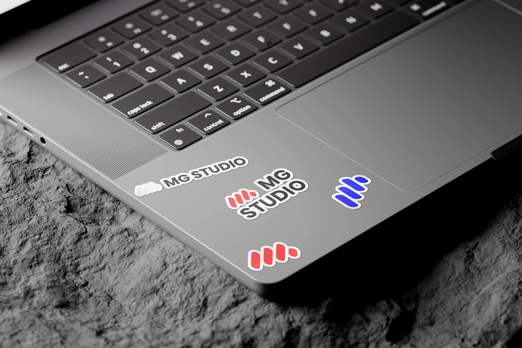
02 · Stickers
The logo, everywhere.
The logo alone or with its name, in red, blue or white.
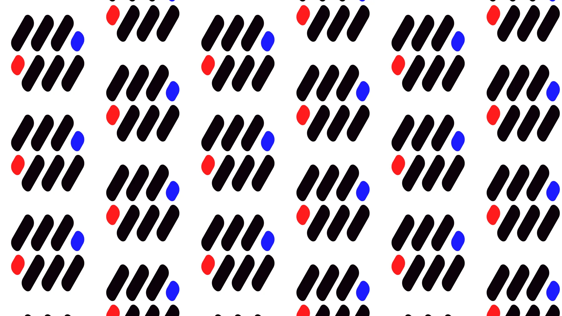
03 · Pattern
A logo that repeats.
The mirrored logo, repeated as a pattern, with a touch of Emotion and Digital.
04 · Posters
Stop thinking, we do better.
A short, direct tagline, in keeping with the agency’s irreverent tone.
05 · Objects
Everyday life at the agency.
A mug and badges in the brand colours.
06 · Welcome
Your new brand image starts here.
The stand’s welcome message, with Digital blue as the accent.
08
The vision
An agency designed to create identities in line with my values, my principles and what I love to create.
Boldness
The courage to make strong decisions.
Difference
Remarkable identities that stand out from the competition in their field.
Impact
Functional, effective and striking brands.
09
What I take away
Transform, don’t just respond.
The goal isn’t to answer a request, but to turn an idea into something functional, effective and striking.
Colours with meaning.
Each colour carries a value: emotion, elegance, digital and neutrality.
A brand that reflects who I am.
An identity in line with my values, my principles and what I love to create.