LA VIE EN GÂTEAUX • CAKE DESIGN • TIERED CAKES • CUPCAKES • FILLED COOKIES • LA VIE EN GÂTEAUX • CAKE DESIGN • TIERED CAKES • CUPCAKES • FILLED COOKIES • LA VIE EN GÂTEAUX • CAKE DESIGN • TIERED CAKES • CUPCAKES • FILLED COOKIES • LA VIE EN GÂTEAUX • CAKE DESIGN • TIERED CAKES • CUPCAKES • FILLED COOKIES • LA VIE EN GÂTEAUX • CAKE DESIGN • TIERED CAKES • CUPCAKES • FILLED COOKIES • LA VIE EN GÂTEAUX • CAKE DESIGN • TIERED CAKES • CUPCAKES • FILLED COOKIES •
A cake design business I’ve supported since its launch in 2021: designer cakes, tiered cakes, cupcakes, biscuits and filled cookies, in and around Clermont-Ferrand.
02
The turning point
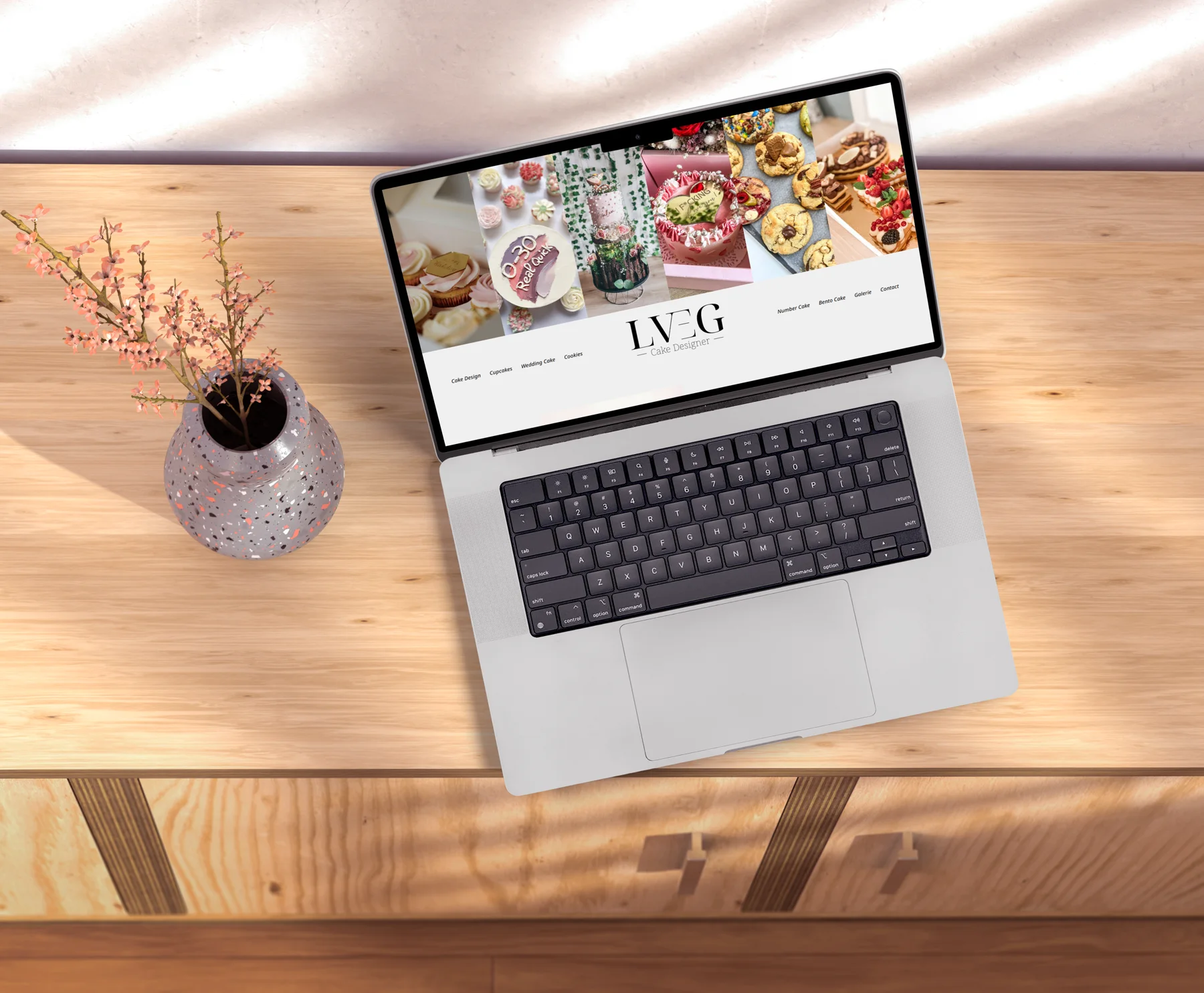
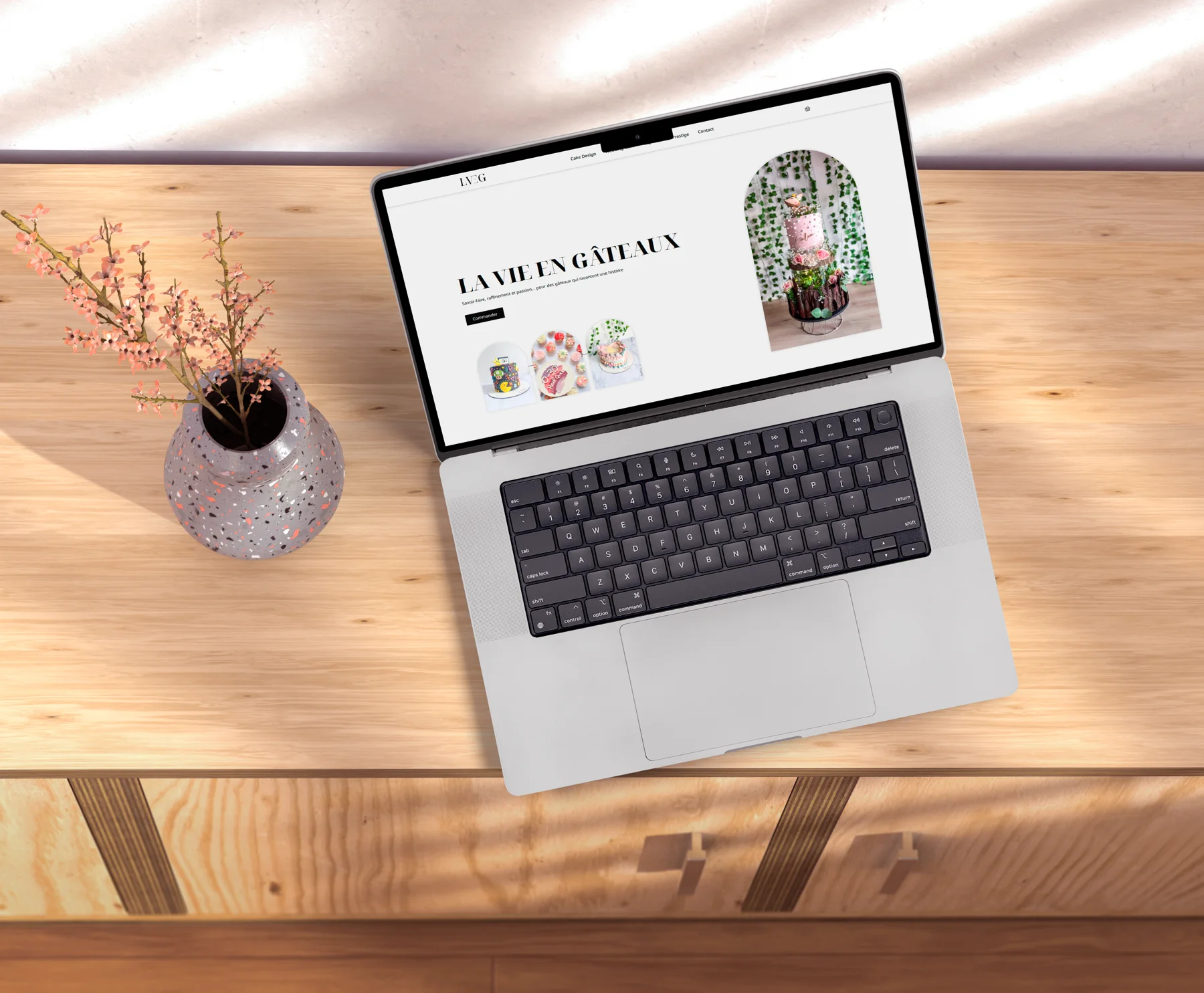
In 2024, the brand reinvented itself: classier, more chic, more upmarket. I designed the rebranding from A to Z.
03
The materials
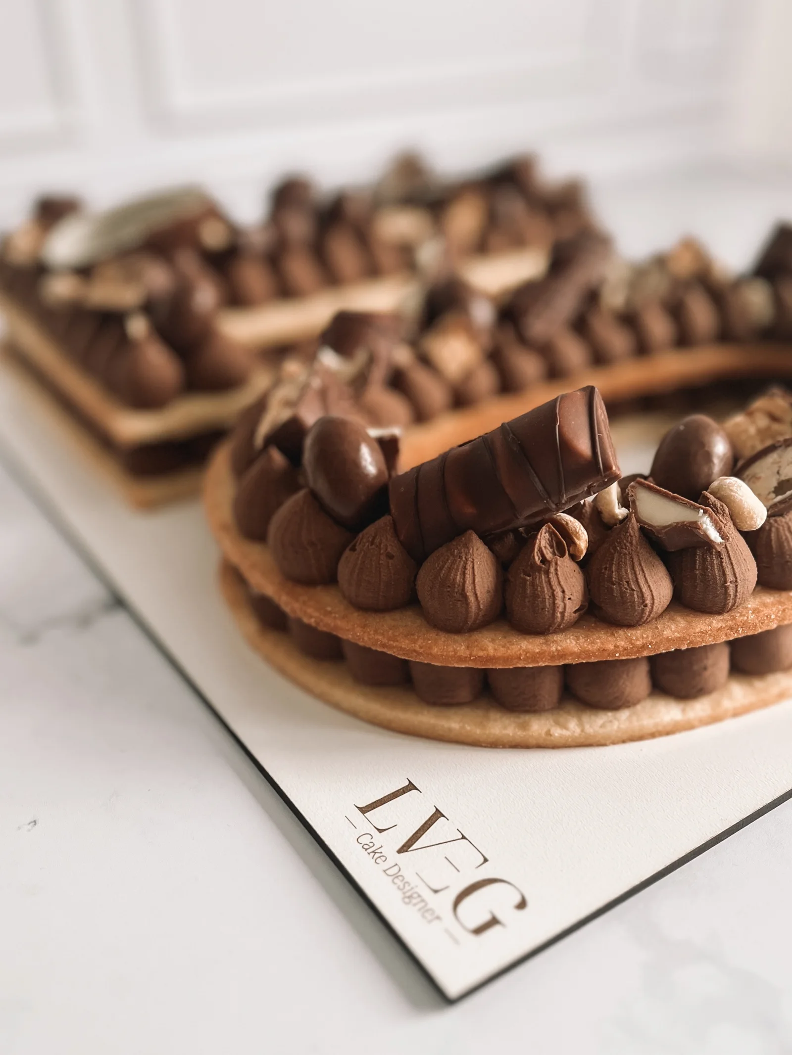
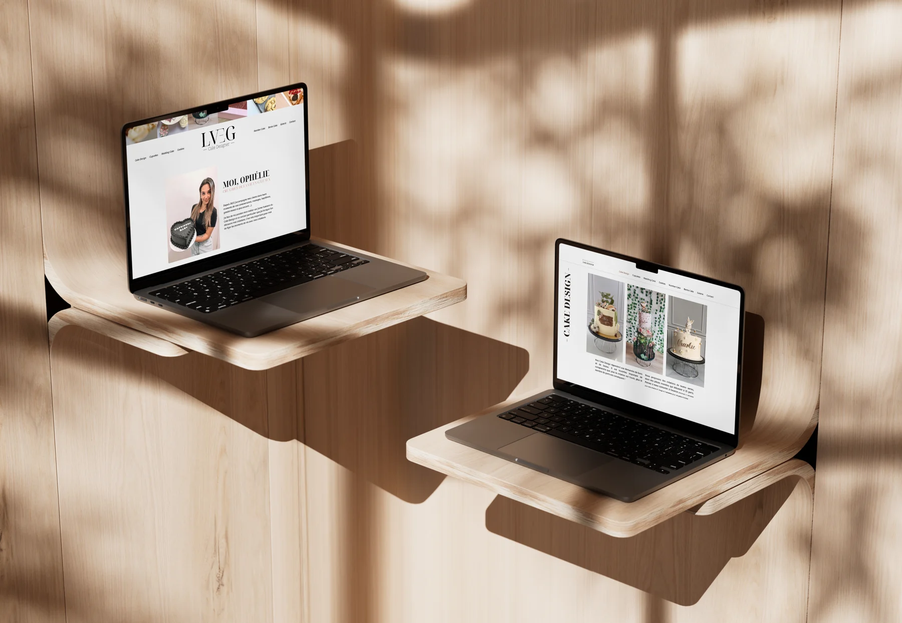
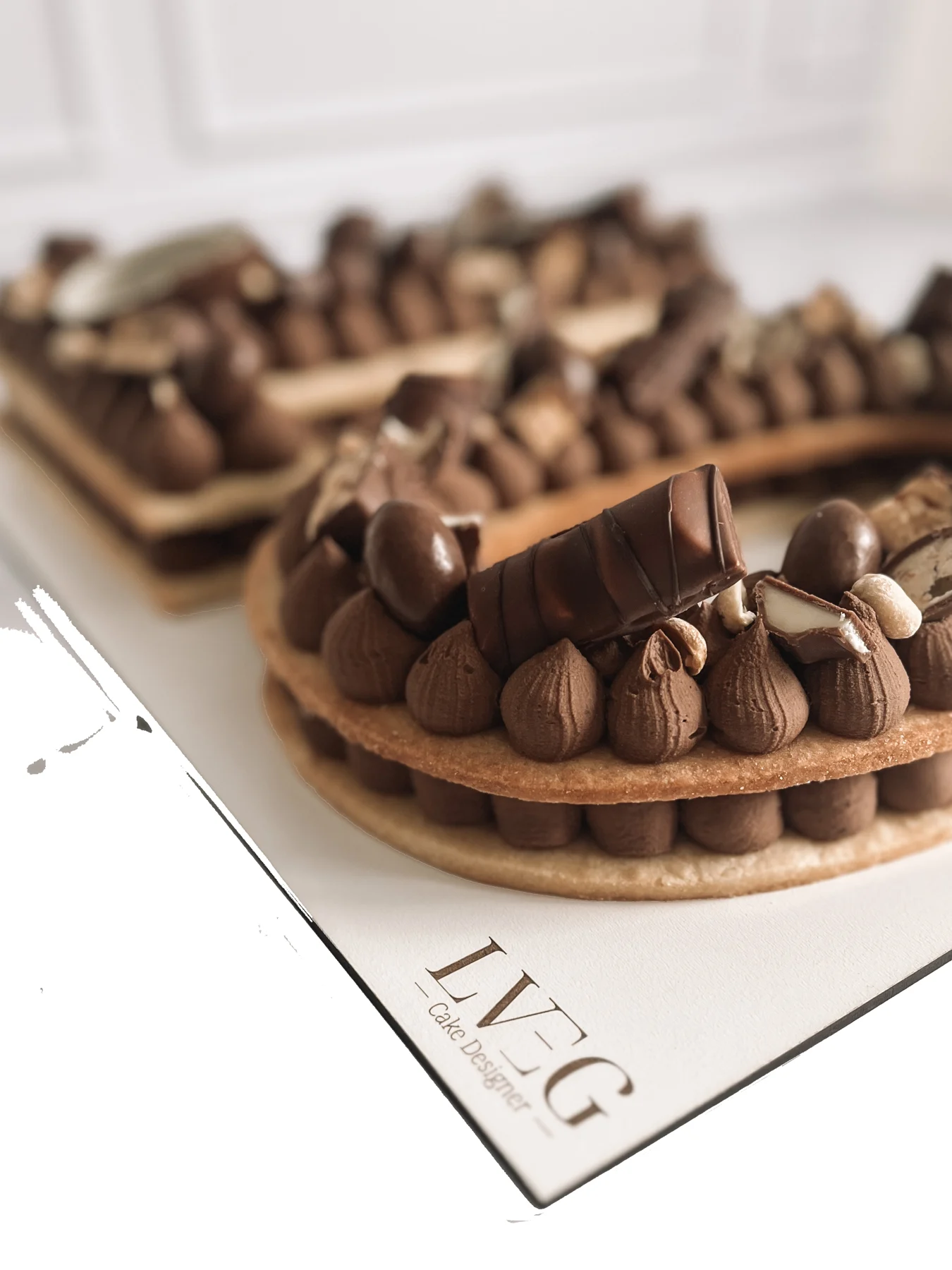
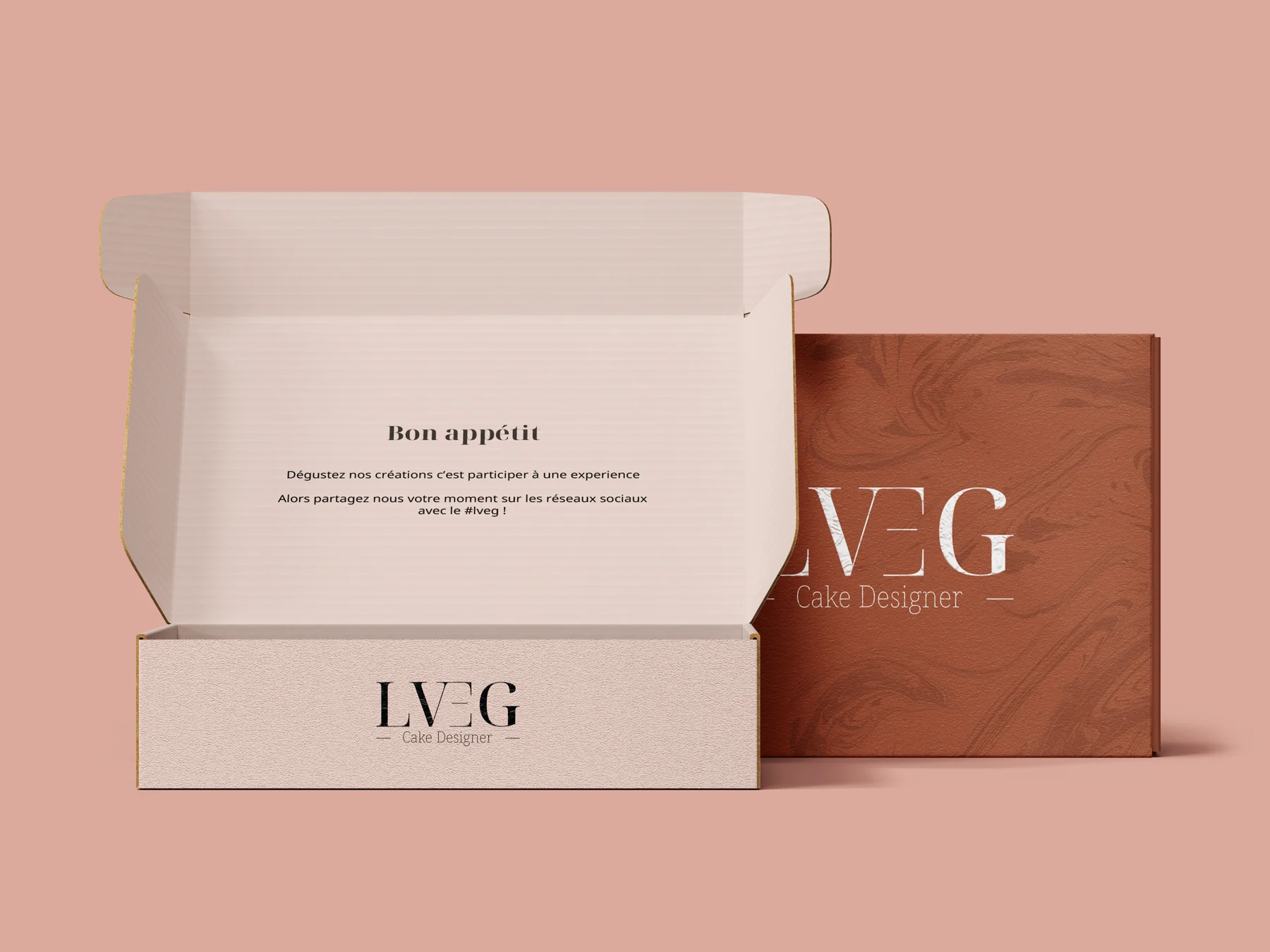
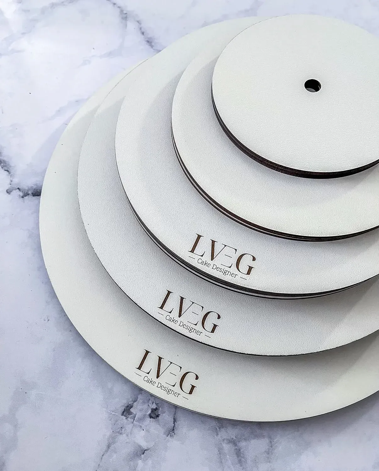
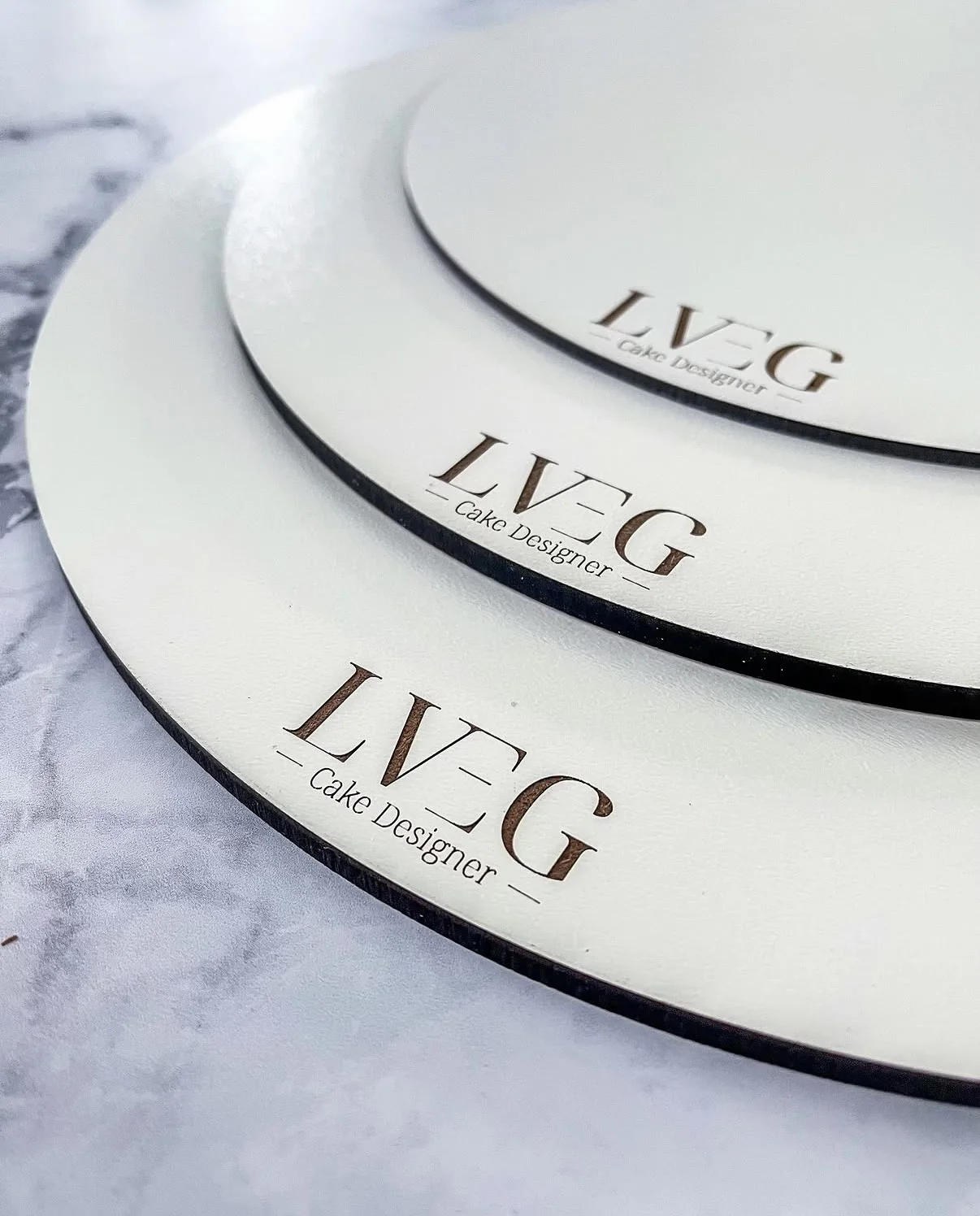
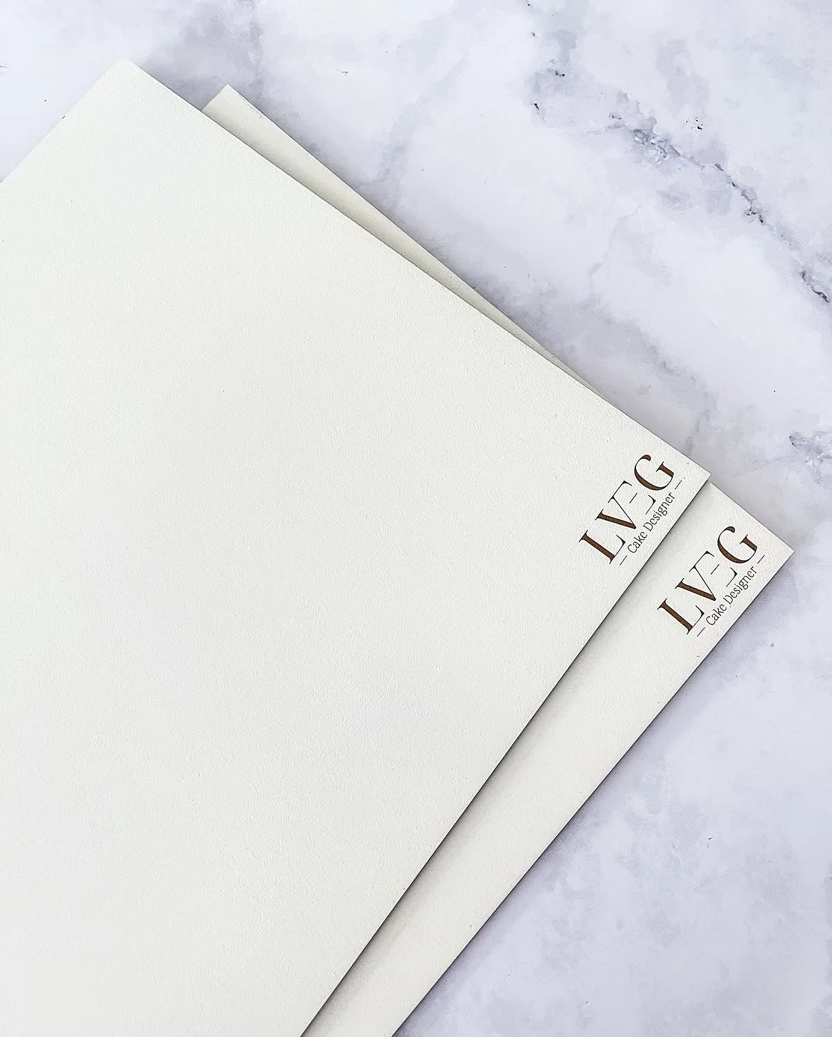
The colours, the typefaces, the layout of the post-wedding flyers, the logo carved into the cake stands, and four website redesigns in four years.
04
What’s next
The filled cookies took off: they became Cookie By LVEG, a brand in its own right, delivered all over France.
02
The starting point
My role
Developer, then designer, since day one.
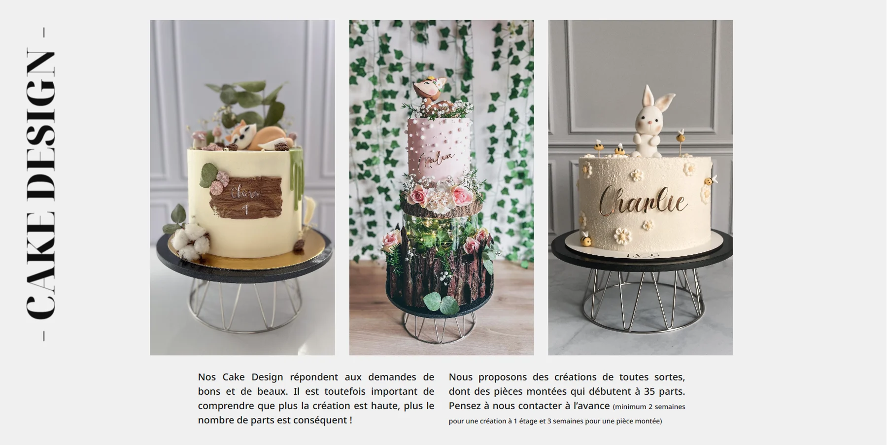
I’ve been part of the project since it began in 2021. I first came on board as the website developer, then as designer from 2024, when the brand reinvented itself with a classier, chic, upmarket image. I designed the rebranding from A to Z: from colours to typefaces, right down to the layout of the post-wedding flyers and the logo carved into the cake stands, which makes such an impression at events. Over four years, I also worked on four website redesigns, while the client fully found her identity in 2025.
2021
alongside the brand since its launch
1
rebranding that paid off in less than two months
+400+
enquiries received within 6 months of the rebranding
03
The colours
CFCFCF9F9F9F6F6F6F3F3F3F0F0F0F0C0C0C090909
CoalA deep black, for text and bold backgrounds.
HEX 0F0F0F RGB 15, 15, 15 CMYK 0, 0, 0, 94
FCFCFCF9F9F9F6F6F6F3F3F3F0F0F0C0C0C0909090
ChantillyA light base, to let the brand breathe.
HEX F0F0F0 RGB 240, 240, 240 CMYK 0, 0, 0, 6
F6ECEAEDD9D4E3C5BFDAB2A9D19F94A77F767D5F59
PeachA powdery accent, for backgrounds and details.
HEX D19F94 RGB 209, 159, 148 CMYK 0, 24, 29, 18
The rule
A simple palette, three colours.
Three colours, not one more: Coal for text, Chantilly to let things breathe, Peach as the accent. A bold black softened by a powdery touch, for an upmarket look.
Distribution
Neutral base, measured accents.
04
The idea
In 2025, La Vie En Gâteaux took an upmarket turn. The idea: give it the look of a Parisian patisserie house, more elegant and more refined, worthy of its creations.
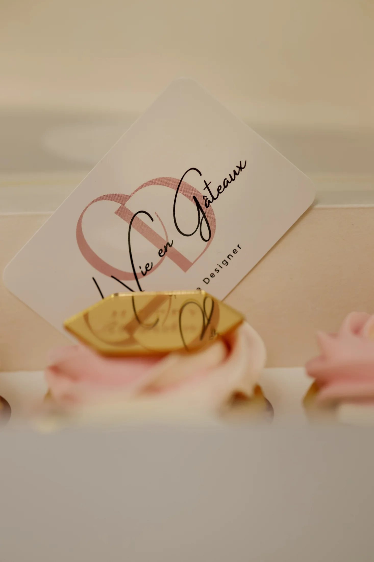
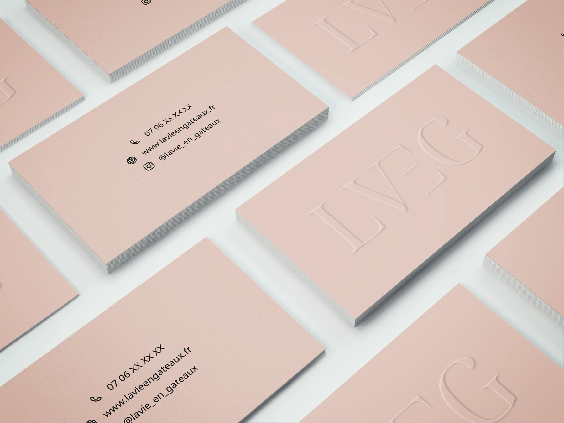
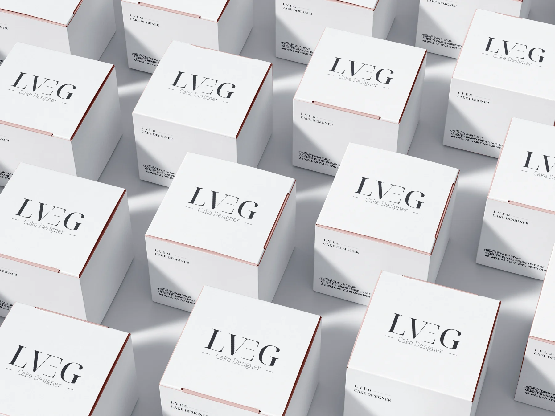
That standard shows everywhere: a refined LVEG monogram, a tight three-colour palette and materials crafted down to the last detail, from the business card to the cake stand.
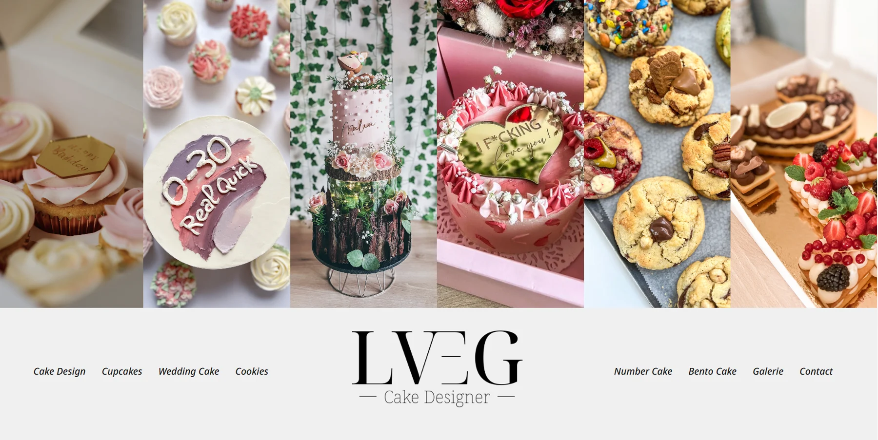
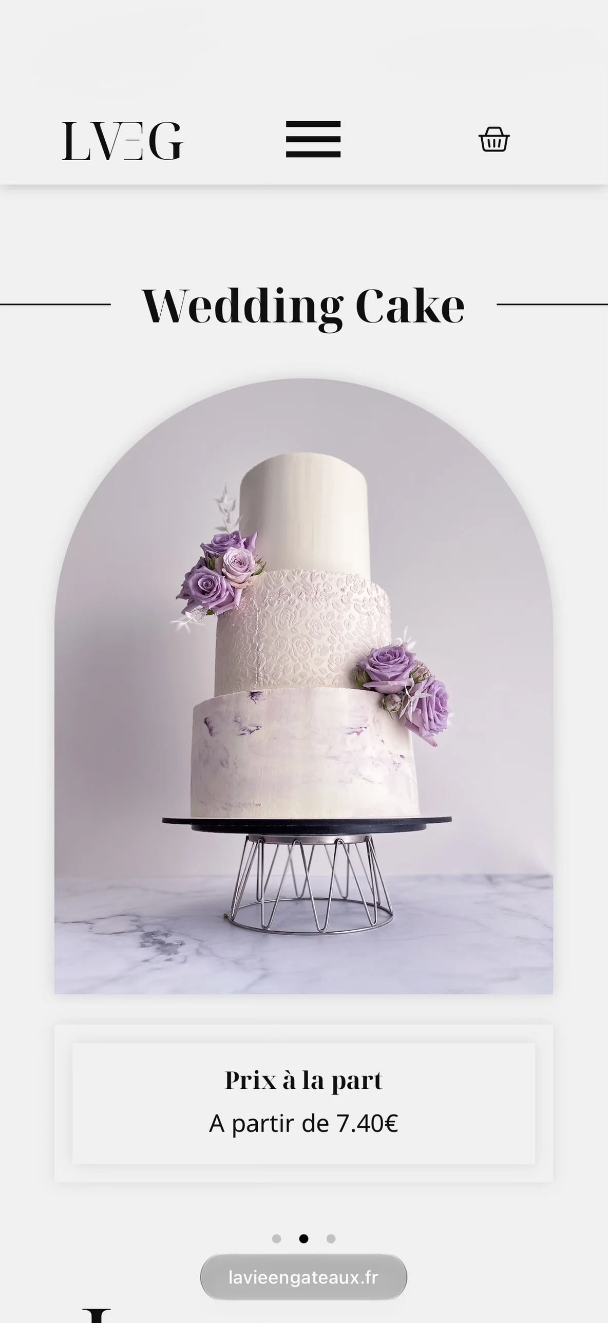
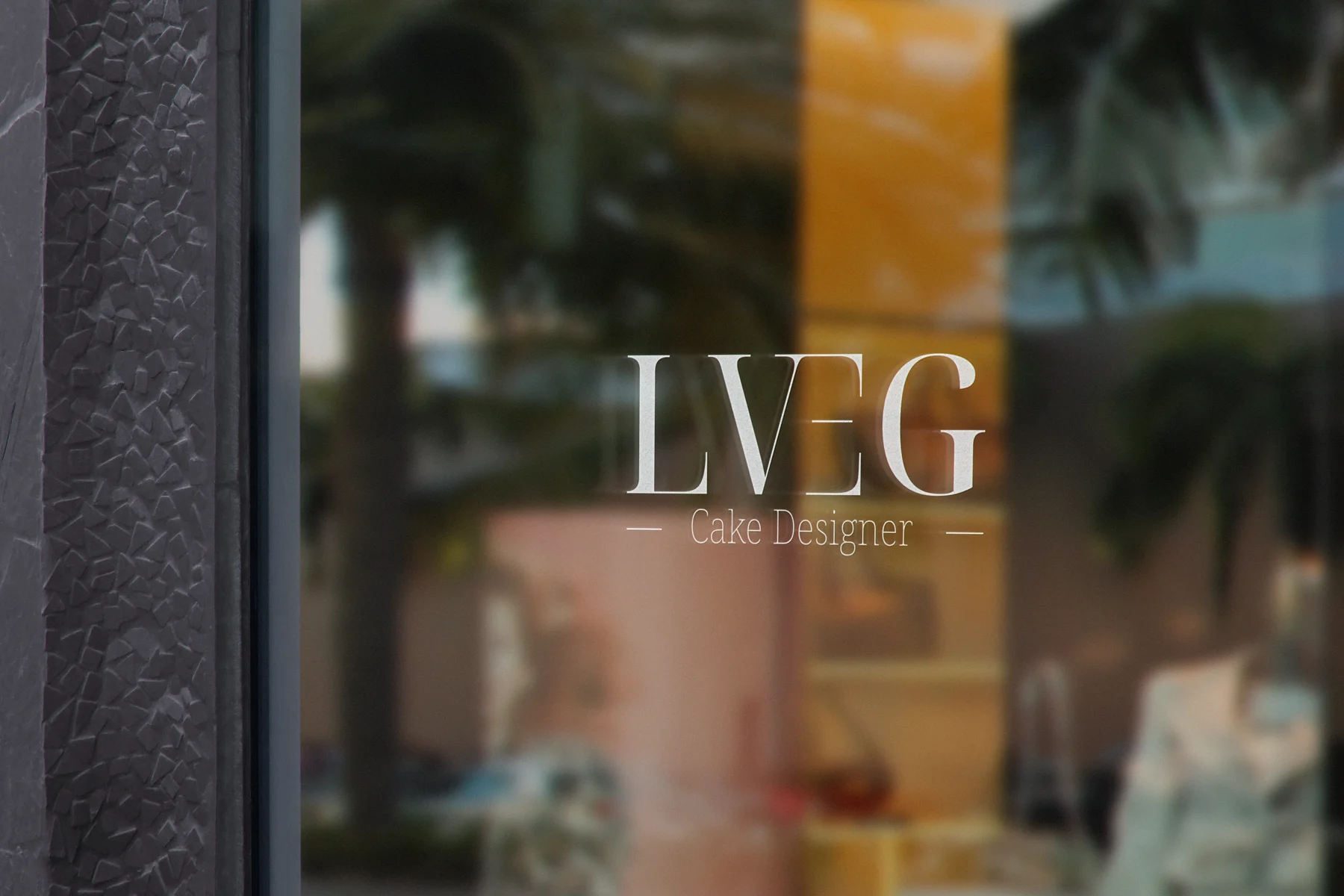
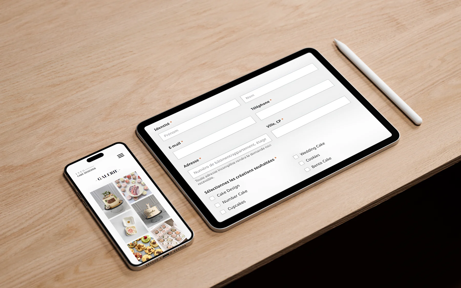
The website on mobileThe shop window
05
Typography
Two families, two roles. Noto Sans carries the reading: open and discreet. Noto Serif Display carries the elegance: high-contrast and refined. Together they set the house’s tone.
Text & interfaceNoto SansLightRegularSemiBold
12345Cap heightx-heightBaselineDescender
1Angled cutThe top of the a ends in an angled cut: the letter stays open and reads quickly.
2Oval bowlThe bowl of the g is an oval taller than it is wide, with taut curves: a generous, legible shape.
3Subtle contrastThe curve thins slightly at the top and bottom: a lively stroke, never stiff.
4Clean diagonalsThe A stands on two straight diagonals and a flattened apex.
5Generous x-heightLowercase letters rise to three quarters of the capitals: the text stays legible, even at small sizes.
A clear, neutral sans-serif for text, menus and practical information. It steps back to give the creations centre stage.