Case study

COOKIE BY LVEG

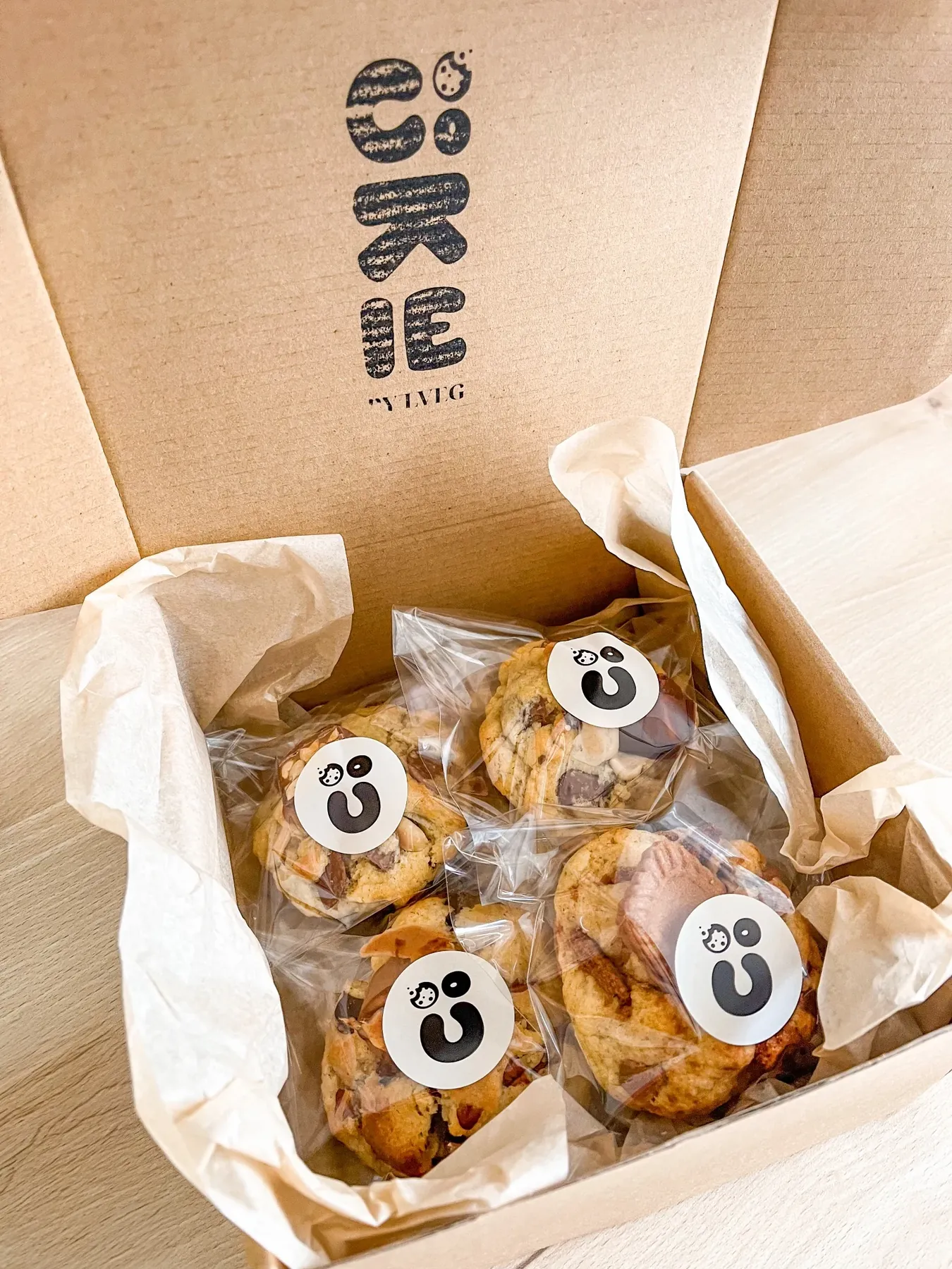
The open Cookie By LVEG box, with the logo on the lid and the cookies in their bags
Brand IdentityLogoE-commerce
Filled cookies, shipped in treat boxes all over France
ClientCookie By LVEG
RoleCo-launch, identity, logo
DeliverablesColours, typefaces, shapes, logo, e-commerce website
Year2024
COOKIE BY LVEG  •  BRAND DESIGN  •  VISUAL IDENTITY  •  ART DIRECTION  •  COOKIE BY LVEG  •  BRAND DESIGN  •  VISUAL IDENTITY  •  ART DIRECTION  •  COOKIE BY LVEG  •  BRAND DESIGN  •  VISUAL IDENTITY  •  ART DIRECTION  •  COOKIE BY LVEG  •  BRAND DESIGN  •  VISUAL IDENTITY  •  ART DIRECTION  •  COOKIE BY LVEG  •  BRAND DESIGN  •  VISUAL IDENTITY  •  ART DIRECTION  •  COOKIE BY LVEG  •  BRAND DESIGN  •  VISUAL IDENTITY  •  ART DIRECTION  • 
01

The brief

Launching La Vie En Gâteaux’s little sister: a brand of filled cookies, shipped in treat boxes all over France.

01

The context

La Vie En Gâteaux’s little sister, focused on filled cookies. A project launched with Ophélie, manager and creator of La Vie En Gâteaux.

02

The identity

Every colour, typeface and shape designed and composed for the brand, right down to the logo: a cookie smiley.

03

The materials

An e-commerce website that handles payment, box building and delivery across France.

04

What’s next

Steady orders every month, driven by follow-up ideas and abandoned-cart techniques.

02

The starting point

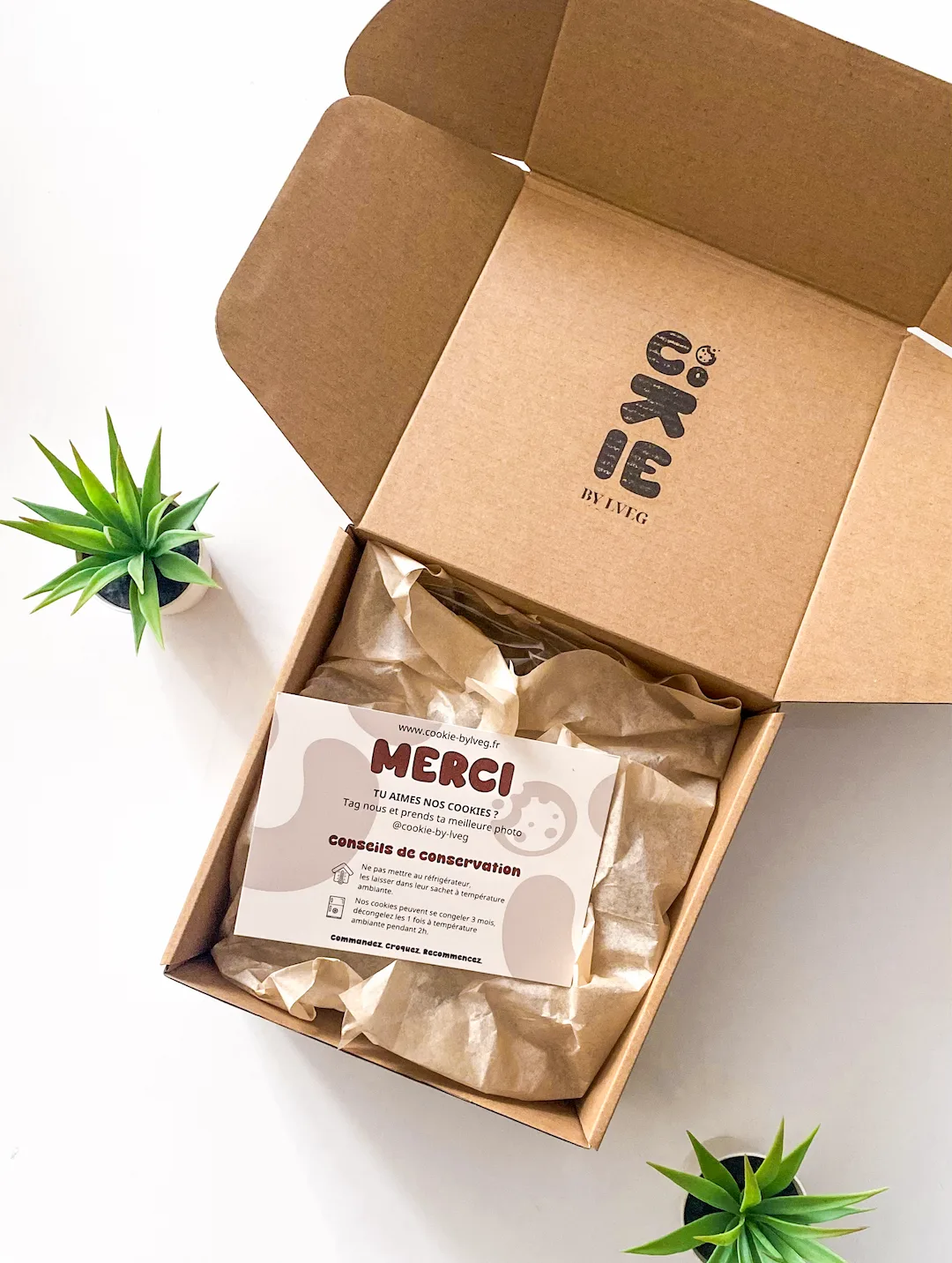
Open Cookie By LVEG delivery box, with its thank-you card
My role

Launched as a duo, from identity to sales.

I launched the project with Ophélie, manager and creator of La Vie En Gâteaux. I designed and composed every colour, typeface and shape, and drew the logo, that cookie smiley. I also helped come up with the cookie names: Snick’Addict, Nut & La, Speculicious, Buenos Dias… I knew more crafted names would help them take off, rather than simply naming them after their main ingredient as competitors do. The names earned us lots of feedback: it’s also a sales technique that sends good vibes to customers before they even buy.

Cookie By LVEG delivery boxes
2

sister brands: La Vie En Gâteaux and Cookie By LVEG

4+

crafted cookie names: Snick’Addict, Nut & La, Speculicious, Buenos Dias…

1

smiley, readable vertically and horizontally

03

The colours

LicoriceThe dark colour, for text and bold backgrounds.
HEX 1A110F
RGB 26, 17, 15
CMYK 0, 35, 42, 90
DoughA nod to the parent house and the pastry chef’s expertise.
HEX FFFBF5
RGB 255, 251, 245
CMYK 0, 2, 4, 0
CaramelA nod to the Snick’Addict, the best-selling cookie.
HEX 6F3A16
RGB 111, 58, 22
CMYK 0, 48, 80, 56
The rule

A simple palette, three colours.

Each colour conveys part of what the box cookies offer: Licorice for the dark colour, Caramel for the best-selling cookie, the Snick’Addict, filled with homemade salted butter caramel, and Dough for the parent house and the pastry chef’s craftsmanship – she wanted to bring classicism and academic know-how into generous, indulgent cookies.

Distribution

Neutral base, measured accents.

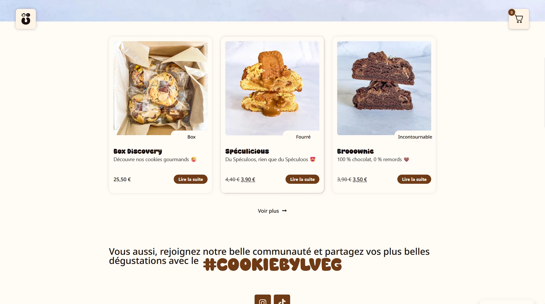
Product pages on the Cookie By LVEG website: Box Discovery, Spéculicious and Brooownie
04

The idea

I started from traditional Japanese writing: a recipe inspired by Japan was about to be released, and I drew my visual influences from vertical Asian scripts. I wanted a logo that reads from top to bottom.

I saw the smiley from the start, but I wanted to fully integrate it into the logo to break with the upmarket spirit of the parent house, La Vie En Gâteaux. Its shape reads both vertically and horizontally: that’s its strength, as it was designed to stay recognisable on a website as well as on plastic packaging or a shipping box.

For the colours, I wanted strong, eye-catching shades that contrast with the cooler, more elegant tones of La Vie En Gâteaux.

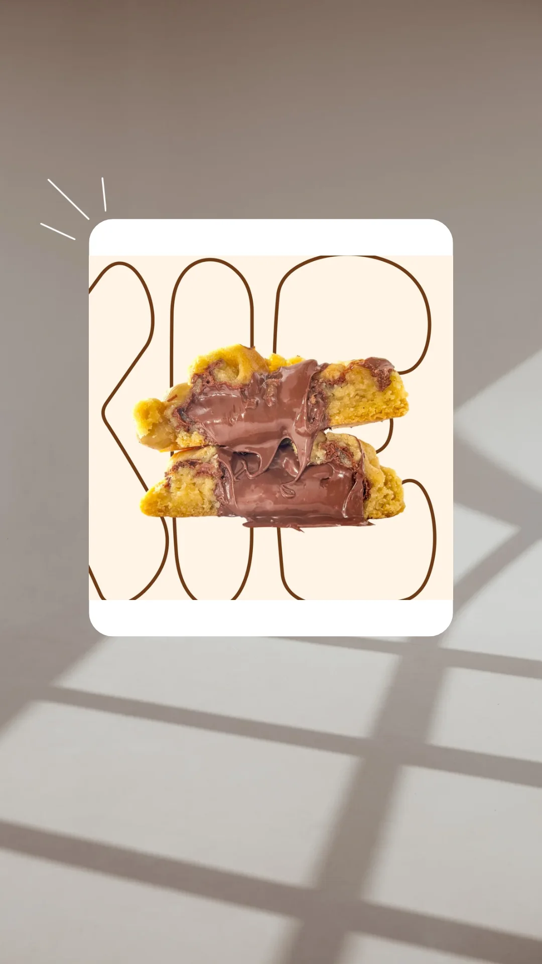
Cookie By LVEG visual: a filled cookie cut in half, over the outlined letters of the logo
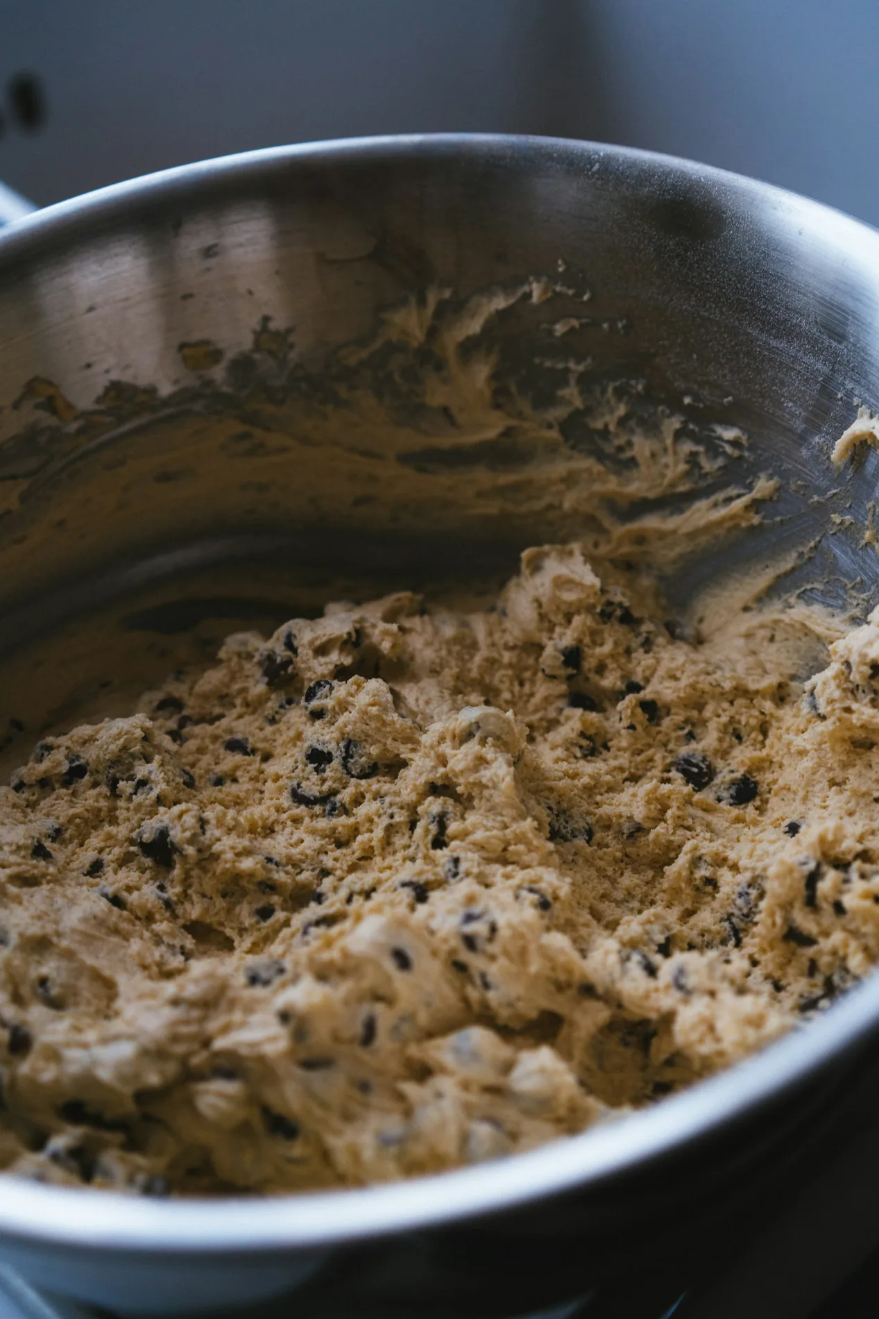
Chocolate chip cookie dough in a bowl
The dough
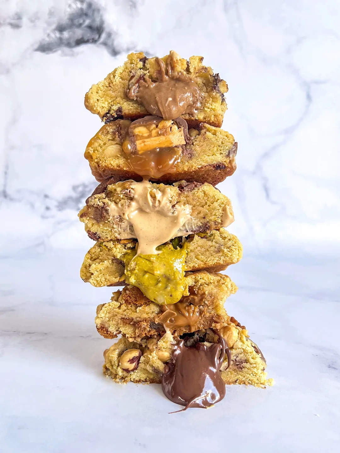
Stack of cut, filled cookies
The filled cookies
Click the box to open it.Move the photos around, then close the box.
05

Typography

Two families, two roles: Super Caramel gives the brand its voice, Nunito supports everything else with the same roundness.

Text & interfaceNunitoWeights to be confirmed
12345Cap heightx-heightBaselineDescender
  1. 1Rounded apexThe A doesn’t end in a point: its apex is softened, with no sharp angle.
  2. 2Round terminalsEvery stroke end is rounded, from the foot of the A to the tail of the g: the text feels soft, even at small sizes.
  3. 3Generous bowlThe bowl of the g is almost round: a full shape reminiscent of a cookie.
  4. 4Even diagonalsThe A stands on two straight, symmetrical diagonals: the letter stays crisp.
  5. 5Constant strokeThe stroke keeps the same thickness throughout: calm reading, no contrast.

A sans-serif with rounded terminals for the website text, menus and practical information. Its roundness extends that of Super Caramel while staying highly legible, supporting the ordering process without ever slowing it down.
Headings & logoSuper CaramelRegular
12345Cap heightx-heightBaselineDescender
  1. 1Tight countersThe inner spaces of the A, a and g are tiny: the letter looks full, almost inflated.
  2. 2Very tall x-heightLowercase letters rise almost as high as the capitals: a massive word, visible from afar.
  3. 3Generous curvesNo sharp angles: the bowl of the a, like every shape, is made of thick curves.
  4. 4Teardrop tailThe tail of the g ends in a nicely rounded drop.
  5. 5Rounded apexThe A doesn’t end in a point: its apex forms a soft arch.

Used for the logo and the website headings. Very round and very bold: I wanted something eye-catching and loud, yet soft in its curves, like the cookie flavours.

06

The logo

Cookie By LVEG

A logo that reads from top to bottom, like vertical Asian scripts, carried by a cookie smiley. Its shape works vertically and horizontally, staying recognisable on the website, the plastic bags and the shipping boxes.

DoughCaramelLicoriceLogo · variations
Main logo
Secondary logo
Monogram
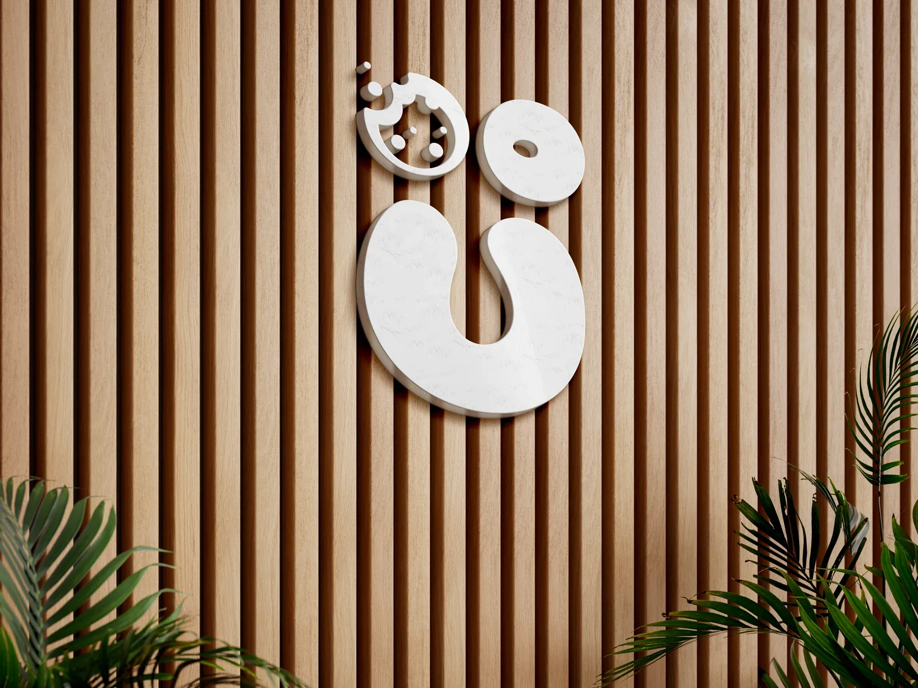
The logo as a sign on a wooden wall

A spin-off takes itself just as seriously as its parent house.

07

Brand applications

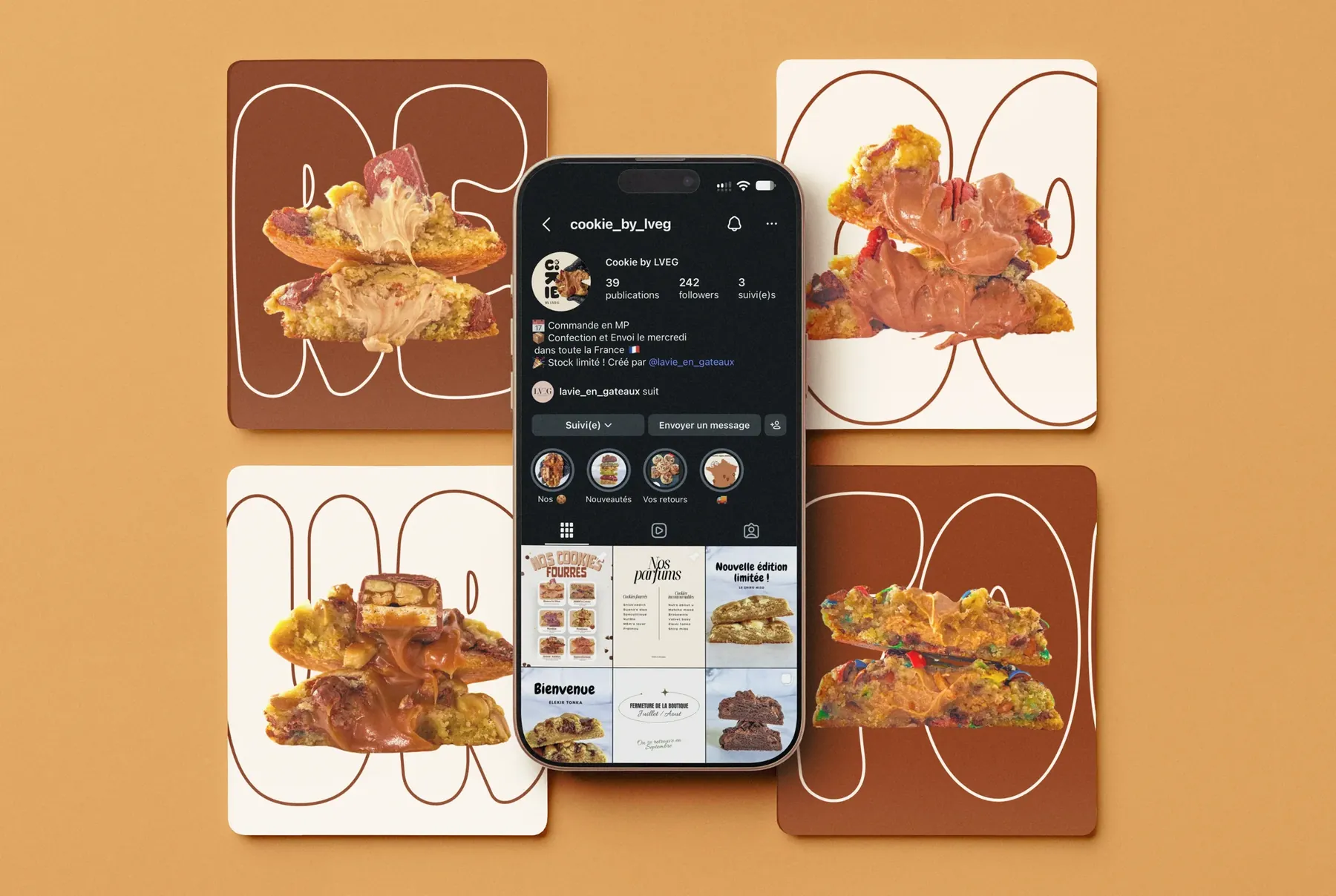
The Cookie By LVEG brand appears across many touchpoints: flyers, delivery boxes and plastic bags, right through to the e-commerce website and the cookie names.

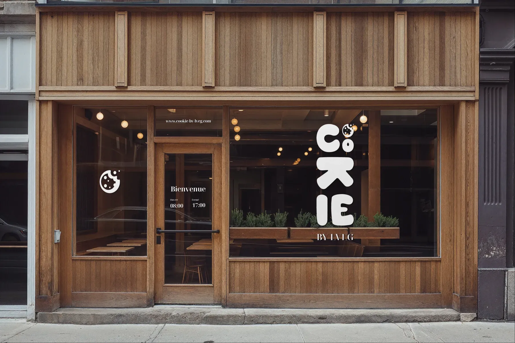
Shopfront in Cookie By LVEG colours
Delivery boxesBagsFlyersBusiness cardsE-commerce websiteInstagram
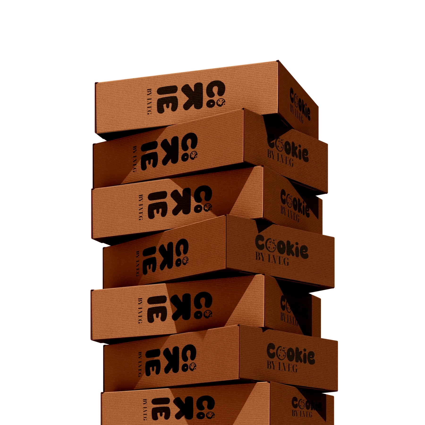
Stack of delivery boxes
01 · Delivery box

A box that travels.

The shipping box for the treat boxes, sent all over France.

Cookies in their bags, sealed with the smiley sticker, inside the box
02 · Bags

Recognisable packaging.

The cookies’ plastic bags, where the logo stays readable vertically and horizontally.

03 · Flyers

Getting known.

Flyers in the brand’s colours, used in particular at the town market.

04 · Business cards

An identifiable stand.

Set out alongside the flyers at the market, to make the brand recognisable.

05 · E-commerce website

Ordering made simple.

Payment, box building and delivery across France, with a notice that tells you when your box will arrive.

06 · The names

Making mouths water before purchase.

Snick’Addict, Nut & La, Speculicious, Buenos Dias… crafted names rather than a plain ingredient.

The cookie_by_lveg Instagram account on a phone, surrounded by cookie visuals in the brand colours
08

The results

Over 120 cookies sold in under 7 hours.

Once the website went live, orders rose sharply. And at a town market, the second day was greatly improved thanks to the flyers, business cards and other brand elements that made the stand recognisable.

Town market · day 2
+120

cookies sold in under 7 hours.

Deliveries
+26

French towns the boxes have been shipped to.

  • Strong growthOrders rose sharply once the website went live.
  • Simple orderingA notice tells customers when they’ll receive their box, depending on when they order.
  • A recognisable brandFlyers, business cards and brand elements transformed the second day of the market.
09

What I take away

Colour changes everything.

Colour can change a brand’s atmosphere: what it gives off and what it stands for.

So does typography.

What the brand gives off is reflected in its typography: very round, very bold, eye-catching and loud, yet soft in its curves, like the cookie flavours.

Standing out takes time.

Talking about the product isn’t enough to set a brand apart from its parent house: you have to showcase how it’s made and its ingredients.

Got a project in mind?

Let’s talk →