Concept project

COFFEE

COFFEE
Brand IdentityPackagingArt direction
A coffee shop that starts from where the coffee is grown to make every drink irresistible
ClientConcept project
RoleIdentity, art direction
DeliverablesLogos, colours, typography, cups
Year2024
COFFEE  •  BRAND DESIGN  •  VISUAL IDENTITY  •  ART DIRECTION  •  COFFEE  •  BRAND DESIGN  •  VISUAL IDENTITY  •  ART DIRECTION  •  COFFEE  •  BRAND DESIGN  •  VISUAL IDENTITY  •  ART DIRECTION  •  COFFEE  •  BRAND DESIGN  •  VISUAL IDENTITY  •  ART DIRECTION  •  COFFEE  •  BRAND DESIGN  •  VISUAL IDENTITY  •  ART DIRECTION  •  COFFEE  •  BRAND DESIGN  •  VISUAL IDENTITY  •  ART DIRECTION  • 
01

The brief

Imagining a coffee shop that starts from where the coffee is grown, to make people crave its drinks, hot or cold.

01

The context

A concept project: a coffee shop brand designed to be recognised for the quality of its product.

02

The identity

Starting from where the coffee is grown to tell its story, and make people crave the hot or cold drinks.

03

The drive to do it right

Creating a modern identity that is deeply rooted in the roaster’s tradition.

04

What’s next

A strong, future-proof identity, designed to reach every age group among potential customers.

02

The colours

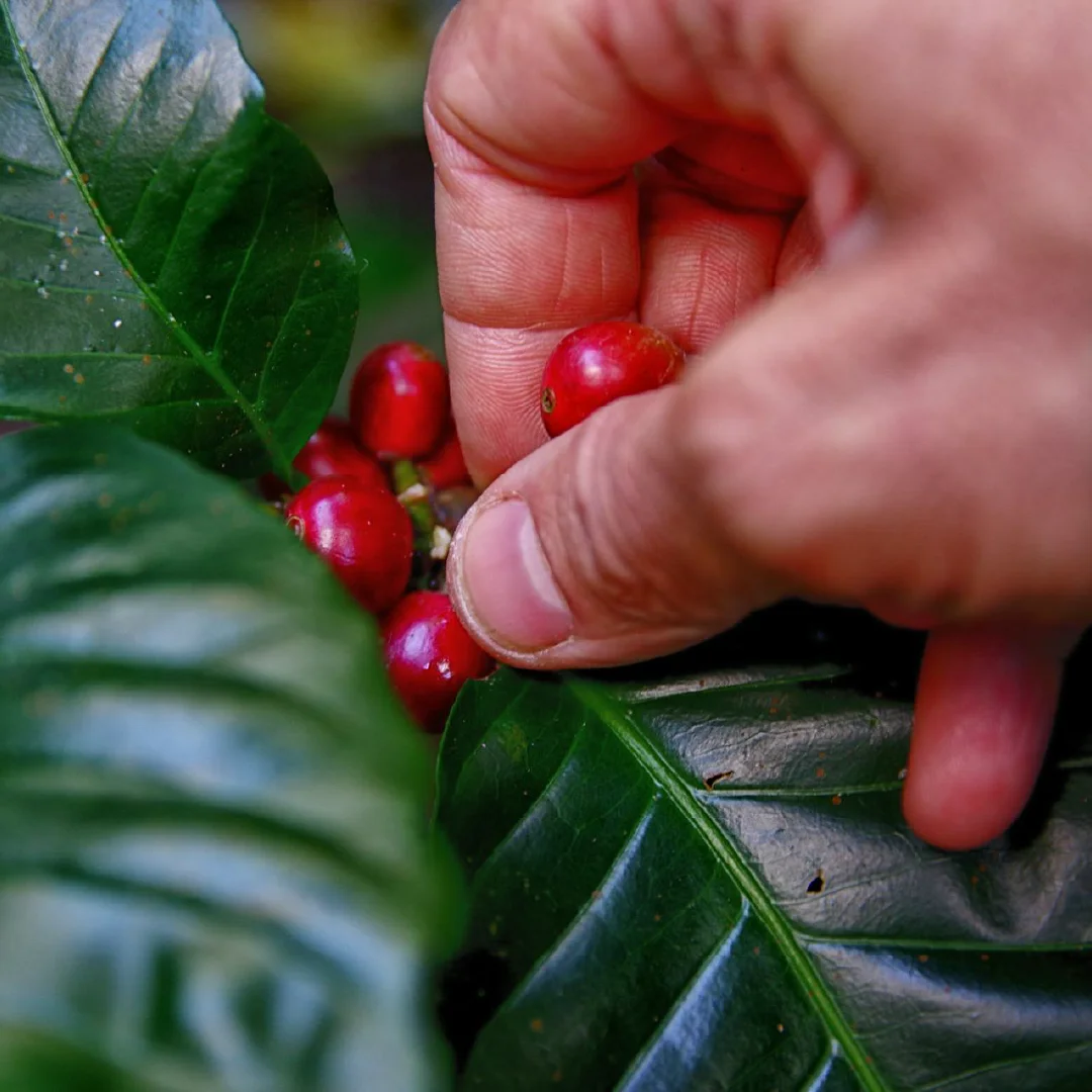
HumidThe freshness of the coffee tree’s leaves, the fruit in its original state.
HEX 2A9134
RGB 42, 145, 52
CMYK 71, 0, 64, 43
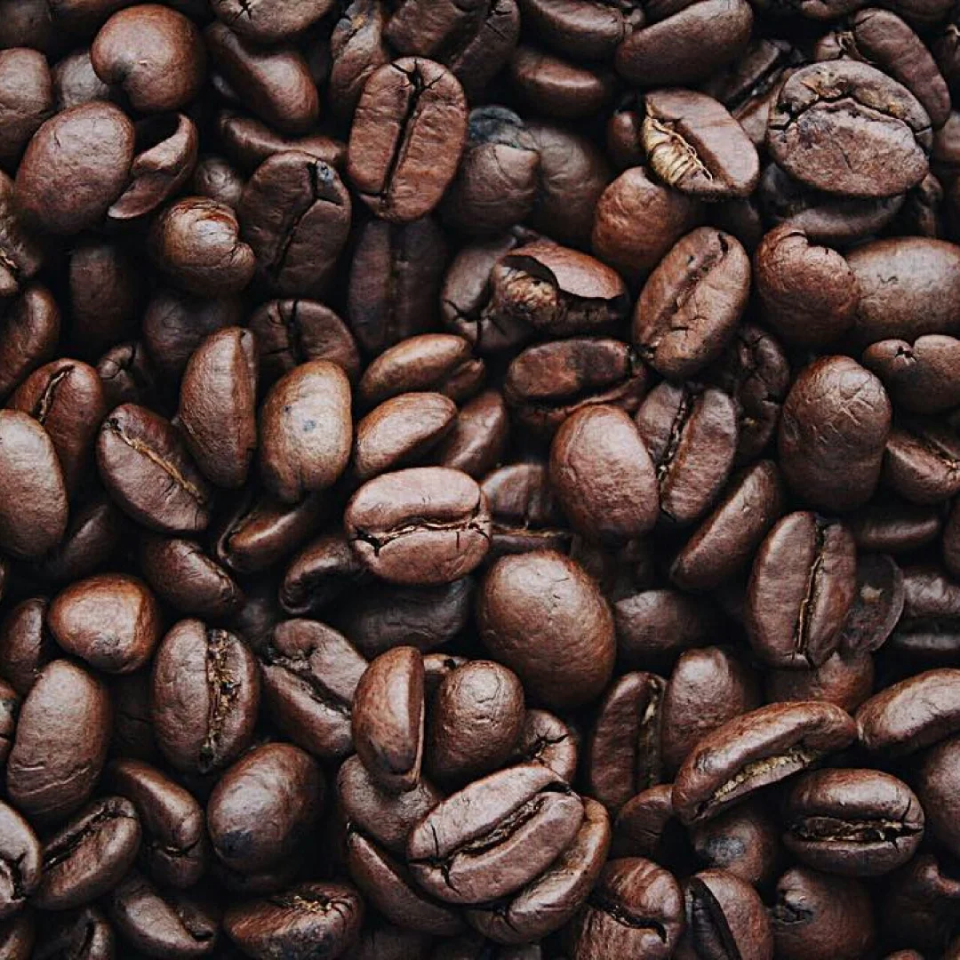
DryThe roasted side of the finished product.
HEX 621B00
RGB 98, 27, 0
CMYK 0, 72, 100, 62
DarkA zone of balance, to enhance consumers’ tastes.
HEX 171614
RGB 23, 22, 20
CMYK 0, 4, 13, 91
LatteThe other zone of balance, softer.
HEX F3F6F4
RGB 243, 246, 244
CMYK 1, 0, 1, 4
The rule

Four colours, from fruit to bean.

The colours were chosen to convey the freshness of coffee: Humid green recalls the leaves of the fruit in its original state, Dry brown explores the roasted side of the finished product. In between, two zones of balance, Latte and Dark, as if to enhance consumers’ two kinds of taste.

Distribution

Neutral base, measured accents.

Harvesting coffee cherries
Humid · the fruit
Roasted coffee beans
Dry · the bean
03

Typography

Two families for the brand: Fredoka and Stika.

Brand typefaceFredokaLightRegularMediumSemiBoldBold
12345Cap heightx-heightBaselineDescender
  1. 1Rounded apexThe A doesn’t end in a point: its apex forms a soft arch.
  2. 2Rounded feetThe stroke ends of the A are rounded, with no sharp angles at all.
  3. 3Round counterThe bowl of the a forms an almost perfect circle.
  4. 4Teardrop terminalThe top of the a’s stem ends in a teardrop, like an inflated shape.
  5. 5Generous tailThe tail of the g curls round and ends in a full, round shape.

A sans-serif with round, generous shapes and no sharp angles: a welcoming typeface that whets the appetite.


Brand typefaceStikaWeights to be confirmed
Specimen coming soon · Stika font file to be supplied

TO BE REPLACED: Stika’s role in the brand.

04

The logo

COFFEE

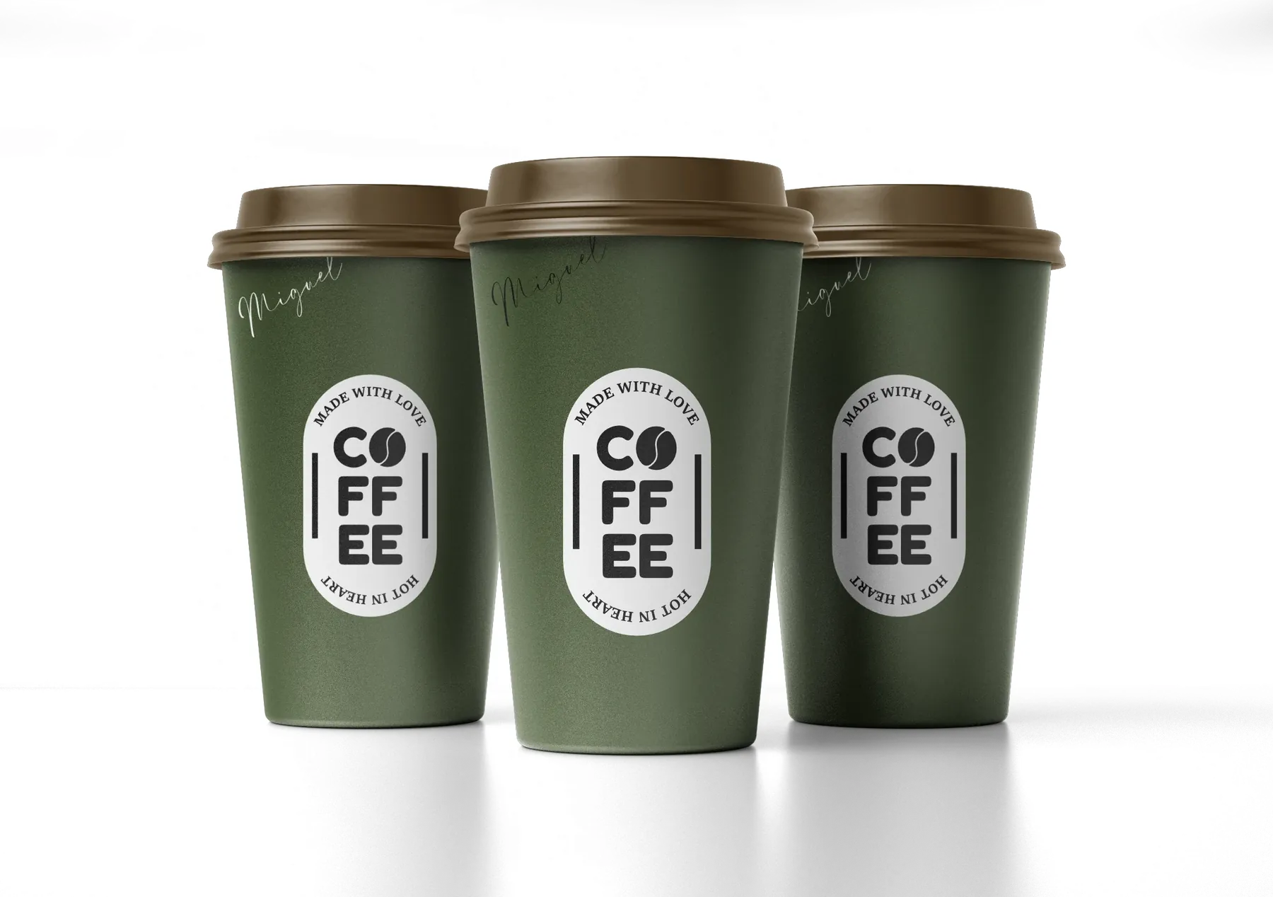
A badge-shaped main logo, encircled by “Made with love” and “Hot in heart”, a horizontal secondary logo and a monogram: the coffee bean.

HumidDryDarkLogo · variations
Main logo
Main logo
Dark version
Main logo, Dark version
Latte version
Main logo, Latte version
Monogram
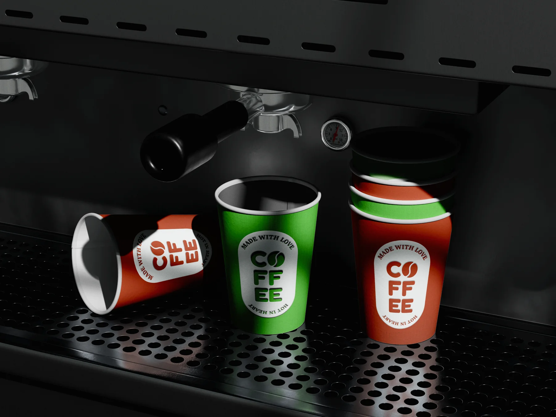
COFFEE cups on an espresso machine

The cups can be moved: grab them.

Made with love, hot in heart.

05

What I take away

Rigour.

A mass-market brand demands rigour: its stakes, its social codes and its visual codes.

Making it tempting.

In food, colours and shapes have to make people hungry for more.

A project to watch.

I’ll be reworking this project to update it over the coming months – with great pleasure.

COFFEE cups

Got a project in mind?

Let’s talk →